|
|
Table of Contents
Price Relative / Relative Strength
What Is the Price Relative Indicator?
Also known as the Relative Strength indicator or Relative Strength Comparative, the Price relative indicator uses a ratio chart to compare the performance of one security to another.
The indicator is often used to do the following:
- Gauge a stock's performance against a benchmark index, such as the S&P 500.
- Evaluate a stock's performance relative to its sector or industry group so you can determine if a stock is outperforming or underperforming its peers.
- Identify stocks that either hold up well during broad stock market declines or exhibit weakness during market upswings.
Note: At StockCharts.com, a ratio ticker symbol is used to create a Price Relative indicator. A ratio symbol consists of two ticker symbols joined together with a colon character (e.g., “IBM:$SPX”, “$INDU:$GOLD”). The value of a ratio ticker symbol is equal to the close of the first symbol divided by the close of the second symbol.
How To Calculate the Price Relative Indicator
Price Relative = Base Security / Comparative Security

Ratio Symbol Close = Close of First Symbol / Close of Second Symbol
Ratio Symbol Open  = Open of First Symbol / Close of Second Symbol
Ratio Symbol High  = High of First Symbol / Close of Second Symbol
Ratio Symbol Low   = Low of First Symbol / Close of Second Symbol
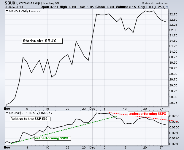
The Price Relative indicator is simply the base security divided by the comparative security. Typically, the underlying security is a stock and the benchmark is the S&P 500. For example, chartists can use the Price Relative to show the performance of Starbucks (SBUX) relative to the S&P 500 ($SPX). This would simply be the price of Starbucks divided by the S&P 500. Starbucks is part of the consumer discretionary sector. Chartists could also view the performance of Starbucks relative to the Consumer Discretionary SPDR (XLY) with the appropriate ratio symbol (SBUX:XLY). Chartists could also view sector performance relative to the S&P 500 (XLY:$SPX).
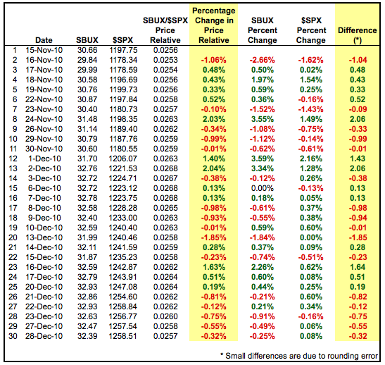
Click here to download this spreadsheet example.
The table above shows the Starbucks/S&P 500 Price Relative. The first value in row two is 0.0256 (30.66/1197.75). This ratio increases when Starbucks advances more than the S&P 500 or declines less than the S&P 500. This ratio decreases when Starbucks advances less than the S&P 500 or declines more than the S&P 500. For reference, the table also shows the percentage change in Starbucks and the S&P 500. The percentage change in Starbucks less the percentage change in the S&P 500 is also equal to the daily changes in the Price Relative. In row two, notice that Starbucks was down 2.66% and the S&P 500 was down 1.62%. The Price Relative moved lower (-1.04%) because Starbucks declined more than the S&P 500. Row three shows the Price Relative rising because Starbucks (+0.50%) was up more than the S&P 500 (+.02%). The chart below shows the Price Relative in action.
How To Interpret the Price Relative Indicator
The Price Relative is used to gauge relative strength, which is important for stock selection. Many portfolio managers compare their performance to a benchmark, such as the S&P 500. Their goal is to outperform that benchmark. Managers often look for stocks that show relative strength to achieve this goal. Enter the Price Relative. The Price Relative rises when a stock shows relative strength and outperforms its benchmark. Conversely, the Price Relative falls when a stock shows relative weakness and is underperforming its benchmark.
There are a few ways to use the Price Relative. First, chartists can perform simple trend analysis to determine the direction of the Price Relative. This can be based on the actual trend, support/resistance breaks, moving averages, or other indicators. Second, chartists can look for bullish and bearish divergences in relative strength to warn of a potential reversal in the stock price.
Trend Identification
Chartists can apply basic trend analysis or moving averages to determine the direction of the Price Relative. As with any price chart, the Price Relative is trending up when higher highs and higher lows form. Conversely, the Price Relative is trending down when lower lows and lower highs form. Chartists can also apply a moving average of choice. A long-term downtrend could be present when the Price Relative is trading below its 150-day SMA. Alternatively, a long-term uptrend could be present when the Price Relative is trading above its 150-day SMA.
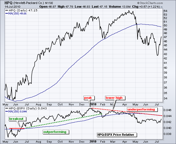
The chart above shows Hewlett-Packard (HPQ) with the Price Relative (HPQ:$SPX). A 15-day SMA was applied to both the HPQ price and the Price Relative. First, notice that the Price Relative broke resistance in mid-June to signal the start of an uptrend. Outperformance continued into December as the Price Relative traced out higher highs and higher lows. The Price Relative peaked in late December and formed a lower high in late February. The subsequent break below the 150-day SMA signaled the start of a downtrend and a period of underperformance.
Bullish/Bearish Divergences
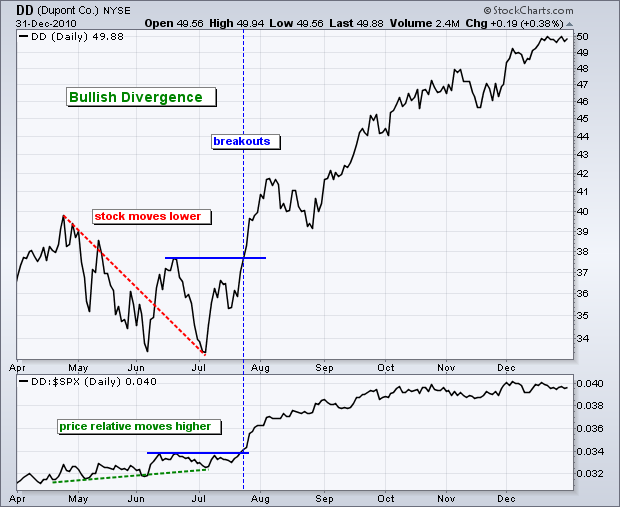
A bullish divergence in the Price Relative signals relative strength during a price decline. Stocks that hold up the best during a decline are often the leaders when the market turns around. The chart below shows Dupont (DD) with the Price Relative (DD:$SPX). Even though the stock declined from late April until early July, the Price Relative moved higher to signal relative strength during this decline. Dupont was holding up better than the overall market. The stock subsequently became a leader when the market reversed and started moving higher in July. Notice that the Price Relative and the stock both broke resistance in late July (blue lines).
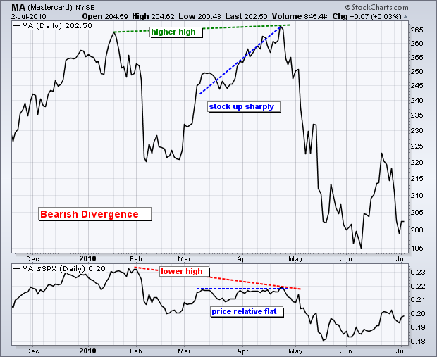
A bearish divergence in the Price Relative signals relative weakness during a price advance. Stocks that underperform on the way up often lead lower when the market reverses. The chart below shows Mastercard (MA) with the Price Relative (MA:$SPX). After a sharp decline in early February, the stock advanced to a new reaction high in late April. The Price Relative did not confirm and formed a significantly lower high for a bearish divergence. Also, notice that Price Relative was flat when the stock advanced from the second week of March until late April (blue lines). These signs of relative weakness on the way up foreshadowed a sharp decline in May.
The Bottom Line
Even though this article focused on using the Price Relative for stocks, the Price Relative can also be used for broad market analysis. The stock market can be broken down into nine sectors represented by the sector SPDRs. Chartists can maintain charts with Price Relatives for these nine sectors to determine the leaders and the laggards. The market is in offensive mode when the technology and consumer discretionary sectors lead. The market is in defensive mode when consumer staples, healthcare, and utility sectors lead. Once the leading sectors have been determined, chartists can then look within these sectors to find the leading stocks. Sectors that show relative weakness can be avoided to help narrow the search. As with all indicators, it is important to use the Price Relative in conjunction with other technical analysis tools. Momentum oscillators and chart patterns can be used to confirm or refute relative strength or relative weakness.
Using with SharpCharts
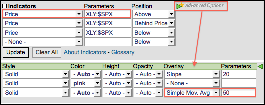
The Price Relative is available in SharpCharts by using the “Price” indicator with a "Ratio" ticker symbol (e.g., “IBM:$SPX”). First, select the “Price” indicator. Second, in the parameter box, enter the symbol for the base security followed by a colon (“:”) and then the symbol for the comparative security.
You can also use the “$SECTOR” and “$INDUSTRY” pseudo-symbols inside a ratio symbol. We will automatically replace those symbols with the appropriate sector or industry ETF/index. For example, “IBM:$SECTOR” is the same as “IBM:XLK” inside of a SharpChart.
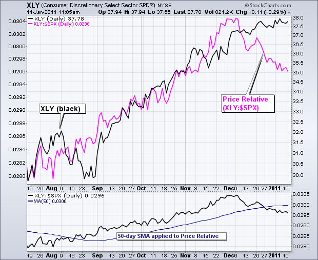
The Price Relative can be placed above, below or behind the price plot of the base security. Placing the indicator “behind price” makes it easy to compare the two lines. The chart below shows the Price Relative (pink) behind the price plot. Notice the bullish divergence in August and the bearish divergence in December. Use “Advanced Options” to add a moving average or another indicator to the Price Relative. Click here for a live example.
Price Relative Indicator FAQs
Is the Price Relative Indicator known by any other names?
Yes, it's also called the Relative Strength Indicator or Relative Strength Comparative.
Can the Price Relative Indicator be used beyond individual stocks?
Yes, the Price Relative can be utilized for broad market analysis, helping determine leaders and laggards among sectors. The results can then guide investors toward the leading stocks within the top-performing sectors.
How is the Price Relative Indicator commonly used?
It's frequently used to gauge the performance of a stock against a benchmark index, such as the S&P 500. It can also compare a stock's performance against its sector or industry group.
What is a ratio ticker symbol on StockCharts.com?
It's a tool used to create a Price Relative indicator. A ratio symbol consists of two ticker symbols with a colon between them (e.g., IBM:$SPX). The value of this symbol represents the close of the first symbol divided by the close of the second.
What are bullish and bearish divergences in the context of the Price Relative?
A bullish divergence signals that a stock displays relative strength during a decline and will likely lead when the market turns upward. A bearish divergence indicates relative weakness during a price ascent, hinting that the stock may decline sharply when the market drops.
Further Study
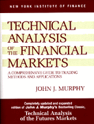
John Murphy's Technical Analysis of the Financial Markets covers relative strength analysis in the chapter on intermarket analysis. Murphy also looks at sector relative strength and shows how to apply relative strength to individual stocks.
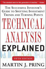
Martin Pring's Technical Analysis Explained features a chapter on the concept of relative strength. Pring shows chart examples to determine relative strength and also teaches readers how to combine relative strength with other indicators.
Additional Resources
Stocks & Commodities Magazine Articles
Relative Strength by Martin Pring
Jun 2001 - Stocks & Commodities V. 19:7 (42-46)
Working Money: Using Relative Strength by Steve Watkins
Apr 2003 - Stocks & Commodities

