|
|
Table of Contents
Percent B Money Flow
Introduction
In his book Bollinger on Bollinger Bands, John Bollinger introduces a trading strategy using %B and the Money Flow Index (MFI). As Bollinger puts it, “the real power of Bollinger Bands becomes evident when they are combined with indicators.” %B and the Money Flow Index are used to identify the start of a new trend when both reach a bullish or bearish threshold. A surge in %B reflects a strong upthrust in prices and high MFI readings indicate strong buying volume. Conversely, a plunge in %B reflects strong downside momentum and low MFI readings show an increase in selling volume.
Defining the Indicators
Percent B (%B) reflects the location of prices within the Bollinger Bands. %B at .80 or higher indicates that current prices are near the upper band and in the top 20% of the Bollinger Band range. Such a move suggests that prices have moved sharply higher with some sort of upside momentum thrust. %B .20 or lower indicates that current prices are near the lower band and in the bottom 20% of the Bollinger Band range. This indicates that prices moved sharply lower with a downside momentum thrust.
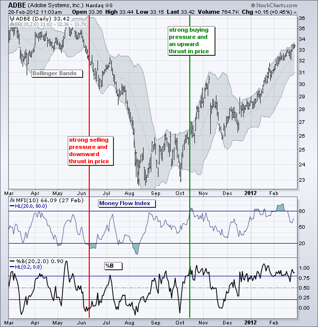
The Money Flow Index (MFI) is a volume-based indicator that measures buying or selling strength. Raw money flow equals the change in typical price multiplied by volume. Raw money flow is positive when the typical price rises for the period and negative when the typical price falls. (Typical price = (H + L + C) / 3). The RSI formula is then applied to raw money flow to create an indicator that oscillates between zero and one hundred.
Strategy
The system is quite straightforward. Buy when %B moves above .80 and the Money Flow Index (MFI) moves above 80. Sell when %B moves below .20 and the Money Flow Index (MFI) moves below 20. Bollinger suggests using the Parabolic SAR for stops.
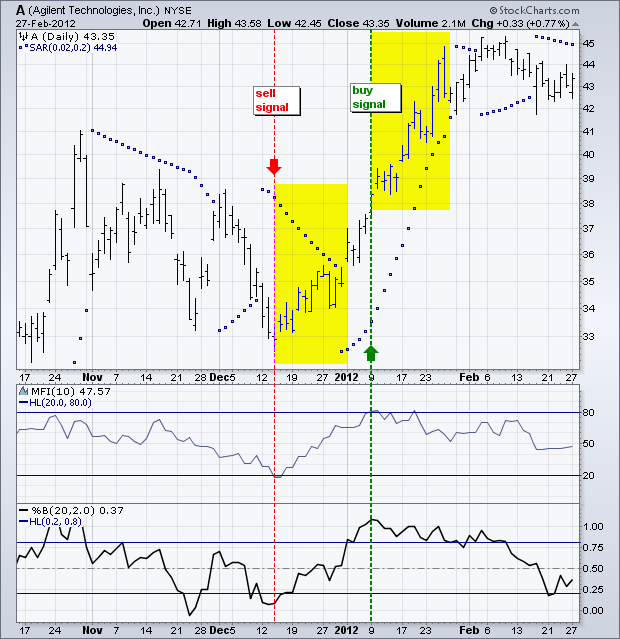
The example above shows Agilent with a sell signal in mid-December and a buy signal in early January. Selling short on the mid-December sell signal would have resulted in a loss, while buying on the early January buy signal would have resulted in a modest gain.
The idea behind the system is to sell weakness and buy strength. A strong up thrust shows strength and further strength is then expected. In theory, the buy signal will occur in the middle of the advance. A strong down thrust shows weakness and further weakness is expected. This means a sell signal will occur in the middle of the decline.
Trading Examples
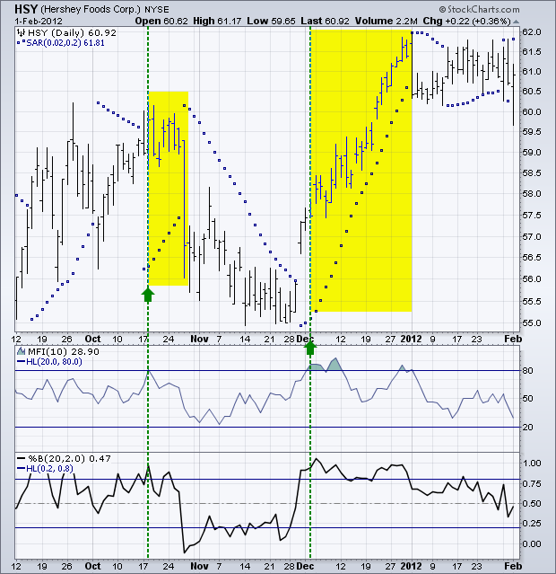
The example below shows Hershey (HSY) with two buy signals within a few months. A sharp decline followed the mid-October buy signal and resulted in a sharp loss. Failure of the trend to continue is the biggest risk to the system. The second buy signal occurred in early December and the advance continued throughout December.
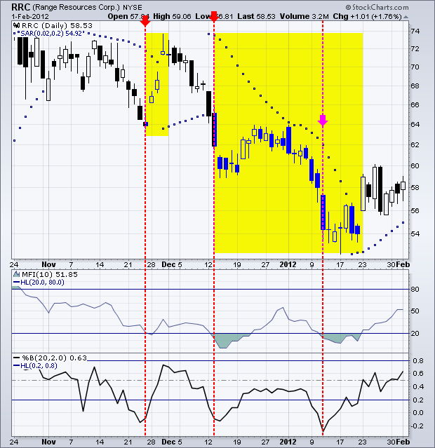
The next example highlights some sell signals for Range Resources (RRC). Notice how the stock surged after the initial sell signal in late November. After triggering a Parabolic SAR stop for a loss, the stock produced another sell signal in mid-December. This one occurred in the middle of the decline as the stock fell further in early January.
Tweaking
While this system will certainly produce some good signals, there is significant risk of a countertrend bounce after a sharp move. In other words, after an up thrust and buy signal, a stock is often short-term overbought and ripe for a pullback already. Some stocks continue higher, but others correct and trigger Parabolic SAR stops.
Chartists should consider using MACD or another momentum oscillator to generate signals in the direction of the emerging trend. After a buy signal, chartists could wait for a pullback and act when MACD crosses above its signal line. After a sell signal, chartists could wait for a bounce and act when MACD crosses below its signal line.
Another suggestion for improving the system is to ensure the absence of an existing trend before a signal is triggered. Low Average Directional Index (ADX) readings indicate the absence of a trend or the presence of a weak trend. Buy and sell signals after low ADX readings would indeed suggest that a new trend is emerging.
The chart below shows these tweaks in action for PNC Financial Services (PNC). First, notice that ADX moved below 15 in April, May and early June. Second, %B plunged below .20 and the Money Flow Index (MFI) fell below 20 to suggest the emergence of a new downtrend. The stock bounced after this signal and MACD turned down in July to trigger a sell signal. Waiting for the MACD signal significantly improved the risk-reward ratio.
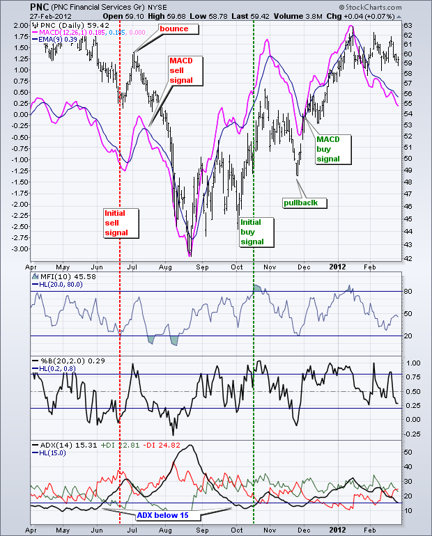
The buy signal setup started with ADX moving back below 15 in October. This was followed by a buy signal as %B surged above .80 and the Money Flow Index exceeded 80. After a pullback in November, MACD triggered a buy signal by moving above its signal line in early December.
Conclusion
%B and MFI combine momentum thrusts and money flow surges to signal the start of a new trend. There is, however, no guarantee that the new trend will extend after the signal. This does not mean the strategy is useless. There are some good ideas here and chartists should use these ideas to augment their trading style and current systems. In fact, Bollinger invites readers to explore variations and use what he termed “rational analysis” with this strategy. Click here for a chart of the S&P 500 with %B, MFI, ADX and MACD.
