
|
Table of Contents
Candlesticks and Traditional Chart Analysis
Introduction
In addition to their own merits as a charting system, Japanese candlesticks can also function as confirmation for signals generated by other technical analysis techniques. In this article, we will examine the ways candlesticks interact with moving averages, breakout signals, head & shoulders patterns and volume, forming mutually beneficial relationships that strengthen investors' confidence in their observations.
Candlesticks and Moving Averages
A key feature provided by candlestick patterns is the ability to confirm moving average signals. In the following chart, the two highlighted areas show two separate candlestick patterns, spinning top and doji, followed by a long white (hollow) candlestick. The interpretation of these candlestick patterns add bullish confirmation of the 200-day moving average at support levels around October 10 and February 5. Moreover, those same Japanese candlestick patterns confirmed the 30 level on the RSI as an oversold condition.

Candlesticks and Breakouts
Candlesticks can also add confirmation to breakouts from traditional chart patterns that are found within congestion zones. When a bullish or bearish Candlestick Pattern occurs within the vicinity of a traditional breakout, it adds validity to the direction of that breakout. An example is shown in the chart below, where the eventual breakout is to the downside.
At first, the top line of the triangle is touched twice by spinning-top candlesticks, which indicates indecision. Then, just prior to the downward breakout from the triangle, there appears a bearish harami candlestick pattern, followed by another down day to provide confirmation. Once the price action gaps down below the ascending triangle, it does so with a long filled candlestick. Taken together, all of this information adds up to an overall bearish picture.
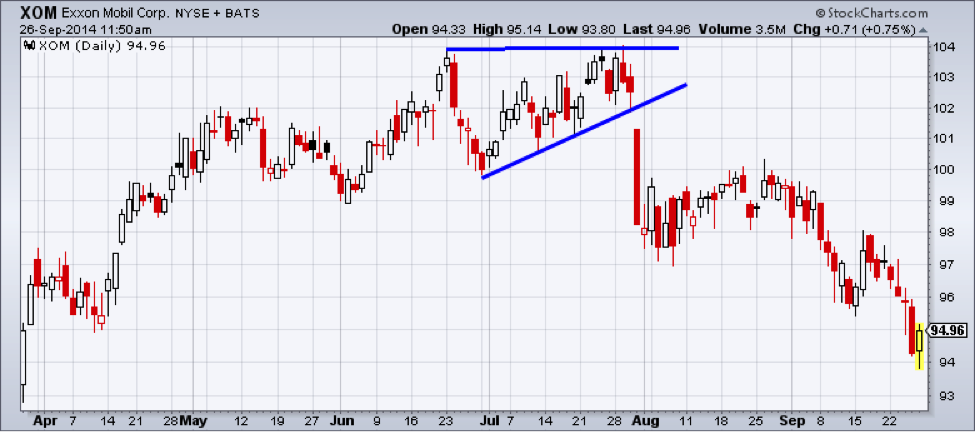
An ascending triangle is traditionally recognized as a bullish chart pattern. But, in this case, the evolving bearish behavior was identified using candlestick pattern analysis. The OHLC bar chart below is based on the exact same data as the candlestick chart, but contains less useful information. As you can see, the ascending triangle is easily recognizable. However, without the use of candlestick analysis, it is more difficult to assess the potential direction of the breakout before it occurs.

Candlesticks and the Head & Shoulders Pattern
One limitation of using candlestick patterns by themselves is that they do not provide potential price targets. This can be achieved, however, by combining candlesticks with other technical analysis techniques. The following chart shows a head & shoulders pattern with an eventual breakout to the down side. During the development of the right shoulder, there is a bearish harami pattern followed by two long bearish candles. These add confirmation to the breakout when it occurs. However, without identification of the head & shoulders pattern, the bearish harami would not give any inclination of a potential price target. Using the traditional price target calculation of a head & shoulders pattern, a price target can be calculated by taking the distance from the top of the head to the neckline and subtracting that from the breakout of the neckline.
Using both types of analysis together gives a potentially clearer picture than using either type in isolation. After all, technical analysis is not an exact science, you need to look for confirming signals to build evidence to support a likely outcome. A good corroborating signal gives you more confidence in your trading decisions.
Candlesticks with Volume
Volume can be used to confirm candlestick patterns. The following chart is the same XOM chart shown previously. The only difference is that volume has now been added below the price chart. Volume begins to increase and crosses above the 200-day moving average during the formation of the bearish harami pattern. It then increases dramatically at the breakout of the ascending triangle and slowly decreases throughout the gradual bullish correction following the downside breakout. As the price action turns down again, volume also increases. After a second brief correction, a doji is formed on huge volume (green arrows), and the sell-off in Exxon Mobil continued.

Conclusion
As the previous examples demonstrated, candlestick patterns can be very useful in identifying potential changes in market direction. When used in conjunction with traditional technical analysis, candlestick patterns can add confirmation to those signals. In general, the more supporting information you can add to your analysis of chart patterns the more conviction you will have in your trading decisions.
The other advantage to using candlestick pattern analysis, along with other technical analysis tools, is when they provide conflicting signals. When you get conflicting signals, it gives you the opportunity to decide if the weight of the evidence is strong enough to proceed with your trading decision or if you should skip the trade altogether and look for better opportunities.
Technical analysis techniques work best when they are not used in isolation. The more evidence you can gather to support your analysis the more likely you are to make informed decisions – and the more likely you are to know when you are wrong and should get out of a losing position. Candlestick analysis is an excellent tool to help provide this extra evidence to your trading and investing decisions. As a result, Japanese Candlesticks have become a vital asset to modern technical analysts around the world.