
|
Table of Contents
MarketCarpets
Introduction
Understanding what is happening in the market from a technical perspective can involve looking at lots of charts. There are charts of high-level composites and averages, sector indices and industry indices, not to mention the charts of individual stocks themselves. Stock scans can often reduce the number of charts that an analyst must look at, but they always leave you wondering, “Did the scan miss anything?”
StockCharts' MarketCarpet tool can help solve these problems. MarketCarpets provide a representation of what sectors, industries and stocks are hot at the moment. Think of it as a visual stock screening tool; simple to use, yet extremely powerful.
Construction
The MarketCarpet tool presents a large collection (universe) of securities as a “carpet” of colored squares. Each square represents a stock, mutual fund or index. Within the carpet, the squares may be arranged in sub-groups based on sector, industry group or other characteristics.

The carpet may be viewed in market cap mode, where the square size is based on market cap, or in square mode, where each square is the same size, giving equal visual weight to each security in the universe. The squares are color-coded to tell you at a glance which stocks are performing well (green) or poorly (red).
Note: The MarketCarpet tool offers several different color schemes to suit users' personal color preferences. In this article, we will use the default color scheme of “Red, White, Green.”
MarketCarpet Universes
We offer several different predefined MarketCarpets, covering everything from S&P stocks to mutual funds to Canadian stocks. We also have a predefined MarketCarpet covering all the indices in our Market Summary page, which can be used for quick intermarket analysis. In addition, you can view any one of your ChartLists in MarketCarpet view. This is a great way to see the performance of all your watchlist stocks at a glance.
MarketCarpet Indicators
The color-coded performance of securities on the MarketCarpet is based on their price change by default, but the MarketCarpet can be configured to base performance on several other indicators, including RSI, Bollinger Band Width, SCTR values and more.
Some indicators can operate in either absolute mode (showing one period's values) or in change mode (showing the change in value over a configurable period of time).
Learning More
This section provides only a brief introduction to the capabilities of our MarketCarpet tool. For more detailed information on creating and configuring MarketCarpets, please see our Support Center article on MarketCarpets.
Interpretation
By default, the MarketCarpet will use price change values to color-code the squares, but there are several other indicators you can choose from. Below is a brief description of each indicator available for MarketCarpets, as well as interpretation guidelines for that indicator.
Price
Price is simply the percent increase or decrease in a stock's closing value over time. Unlike most of the other indicators, it requires a start date and an end date for the calculation, so it only works in Change mode. It is calculated by subtracting the starting close value from the ending close value, then converting that value to a percentage by dividing by the starting close value and multiplying by 100.
Price shows you the bottom line. Stocks that have been increasing in price will be green, while those that have been falling will be red. Dark green is good (for longs) and dark red is bad. The timeframe for the price change measurement can be lengthened or shortened using the date slider below the chart.
SCTR
The SCTR, or StockCharts Technical Rank, is a numerical score that ranks a stock against its peers using six different technical measurements. On the MarketCarpet, the SCTR values can be used in Absolute or Change mode. In Absolute mode, each square is colored based on the specified day's SCTR score. In Change mode, each square is colored based on the increase or decrease in SCTR score over the specified time period.
The SCTR score is calculated using a wide range of indicators covering several different timeframes, so it is an excellent summary of a stock's performance relative to its peers. In Absolute mode, stocks in dark green have a very high SCTR score, while stocks in dark red have a very low SCTR score. Change mode allows you to find stocks whose SCTR scores are improving (green) or worsening (red) over the specified timeframe.
Up Days-Down Days
As its name implies, this indicator counts the number of days that a stock moves higher and then subtracts the number of days that it moves lower during the specified timeframe. Like Price, this indicator only works in Change mode. To get good results, the date slider really needs to include four or more days in the calculation.
This indicator is often the best one to use for measuring overall market breadth and sector rotation effects. If you are interested in finding stocks with consistent increases or decreases, this indicator can help.
RSI
The RSI indicator is described in detail in our ChartSchool article on the Relative Strength Index (RSI). It ranges between 0 and 100. The MarketCarpet computes the value of the 14-day RSI for every stock. In Absolute mode, each square is colored based on the stock's RSI value for the date specified. In change mode, each square is colored based on the increase or decrease in the value of RSI over the specified timeframe.
RSI measures momentum by comparing the magnitude of a stock's gains on up-days with the magnitude of its losses on down-days. In a sense, it attempts to combine two other MarketCarpet Indicators (Price and Up Days-Down Days) into a single value. In Absolute mode, this indicator shows stocks that have performed well consistently during the previous 14 days. In Change mode, the carpet will point you to some potentially great turnaround plays.
PPO
The PPO indicator is described in detail in our ChartSchool article on the Percentage Price Oscillator (PPO). The PPO is very similar to another popular indicator, the MACD; the difference is that the PPO is scaled to be price independent. This means that you can compare the PPO value for a stock that is $90/share with the PPO value for a stock that is $3/share - something that isn't possible with the MACD. On the MarketCarpet, the PPO indicator is calculated using the standard 12-26-9 parameters. Both Absolute and Change modes are supported.
Green boxes reflect positive PPO values, which means the 12-day EMA is above the 26-day EMA. The darker the green, the bigger the positive difference in the EMAs. Red boxes reflect negative PPO values, which means the 12-day EMA is below the 26-day EMA. The darker the red, the bigger the negative difference in the EMAs.
Bollinger BandWidth
Bollinger Bands are two lines that are drawn two standard deviations above and below the 20-day moving average for a given stock. The distance between the upper and lower lines is the Bollinger BandWidth. (Our ChartSchool article on Bollinger BandWidth gives more details.) The distance between the upper and lower lines changes depending on the volatility of the given stock, meaning Bollinger BandWidth is a measure of a stock's volatility.
The MarketCarpet displays Bollinger BandWidth on a quasi-percentage basis so that stocks with different prices can be compared. In Absolute mode, the squares are colored using the value of the upper band minus the value of the lower band, divided by the value of the central moving average and multiplied by 100. The result is a value that ranges mostly between zero and 100 (although higher values are possible).
Low values correspond to low volatility and high values correspond to high volatility. You can use Absolute mode to find stocks that have high (green) or low (red) volatilities on the specified date. Change mode will show you which stocks have gotten more volatile (green) or more stable (red).
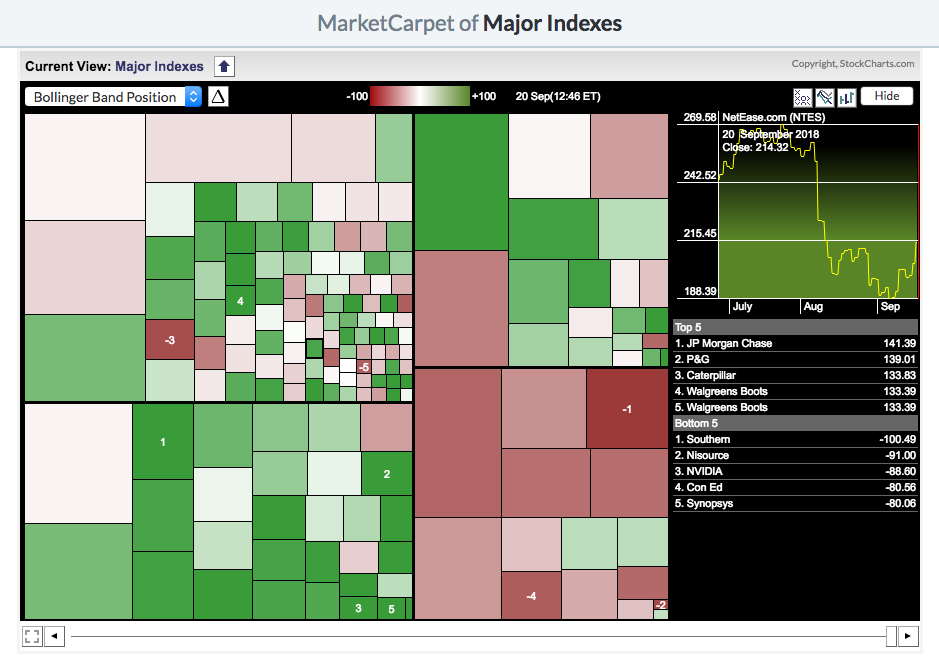
Bollinger Band Position
Bollinger Bands, described in detail in our ChartSchool article on Bollinger Bands, center around the 20-day moving average for a given stock. The Bollinger Band Position indicator converts the area between the upper and lower bands into a range from +100 (the upper band) to -100 (the lower band), with 0 as the position of the central moving average. Note that if the stock is above the upper band, it will have a value above +100, and if it is below the lower band, its value will be below -100.
In Absolute mode, dark green stocks on a Bollinger Band Position MarketCarpet will indicate stocks that are near or above their upper Bollinger Band. Dark red stocks indicate the opposite. Keep in mind that the indicator says nothing about the width of the bands; stocks with very narrow Bollinger Bands can result in misleading values. Always double-click the interesting squares to see the underlying SharpChart for those stocks.
StochRSI
StochRSI is an advanced indicator that combines the Stochastics and RSI oscillators. It ranges between 0 and 1. This indicator is quite sensitive and is prone to giving false signals, but will often give signals very early in important price movements. The indicator is described in detail in our ChartSchool article on StochRSI.
On the StochRSI MarketCarpet, Absolute mode will show high (green) and low (red) StochRSI values on the specified day. In Change mode, the carpet will show stocks with big increases (green) or decreases (red) in their StochRSI values over the specified time period. Note that StochRSI is designed to move quickly from 1 to 0 and back again, so most squares on a StochRSI carpet will either be dark red or dark green, not something in between.
Aroon Oscillator
The Aroon Oscillator plots the difference between Aroon Up and Aroon Down. 25-day Aroon Up measures the number of days since a 25-day high, while 25-day Aroon Down measures the number of days since a 25-day low. Chartists can use the Aroon Oscillator to spot strong trends or emerging trends with big moves. Positive values suggest an uptrend with values above +50 pointing to a strong uptrend. Negative values indicate a downtrend with values below -50 indicating a strong downtrend.
In Absolute mode, symbols with an Aroon Oscillator value above zero will have green boxes, while those with a value below zero will be red. Dark green boxes show stocks with values above 50 and dark red boxes show values below -50. In Change mode, the dark green boxes show the largest positive changes and the dark red boxes show the largest negative changes.
Full Stochastics
The Full Stochastic Oscillator is a momentum indicator that fluctuates between zero and one hundred. This indicator measures the current price level relative to the high-low range over the lookback period (14 days). A reading above 90 means the current price is near the high end of the range, while a reading below 10 means price is near the low end. Readings below 20 suggest a short-term oversold condition, while readings above 80 indicate a short-term overbought condition.
In Absolute mode, symbols with a Stochastic value above 50 have green boxes and those with a value below 50 have red boxes. The dark green boxes represent stocks trading near the high end of their 14-day range, while the dark red boxes highlight stocks trading near the low end. In Change mode, the dark green boxes show the largest positive changes and the dark red boxes show the largest negative changes.
Analysis Examples
MarketCarpets can be used in several different ways to give you different perspectives on the market and on individual stocks. Here are a couple of examples showing how you can use MarketCarpets for analysis.
Finding Buying or Shorting Opportunities
MarketCarpets allow you to visually scan a large group of stocks, quickly finding the best buying or shorting opportunities in the group.
The universe of stocks you choose will depend on your trading style: you can use the S&P Sector MarketCarpet to look for large-cap candidates or the Major Indexes MarketCarpet to find high-tech and blue-chip possibilities. You can also view your own ChartLists in MarketCarpet mode.
The indicator you choose will also depend on your trading style. You could use the basic Price change mode, RSI or Bollinger Band Position to see how the stocks in your universe are performing.
The timeframe is key in this type of short-term analysis. Since you're looking for stocks to invest in right now, you want to use a shorter timeframe for your analysis. Either choose Absolute mode (a snapshot of current values) or use Change mode with a fairly short timeframe.
In the sample MarketCarpet below, we are using the Bollinger Band Position in Absolute mode to scan for investment options on the Major Indexes MarketCarpet.
Exploring Sector Rotation
MarketCarpets are a great way to fully explore sector rotation within a group. In the past, analysts have tried using sector-oriented indices or funds to represent the performance of each sector as a whole. The problem with this approach is that each sector index hides what is actually happening with each of the stocks that make up that index. One very weak stock may cause the sector index to decline, even when all of the other stocks in the sector are healthy.
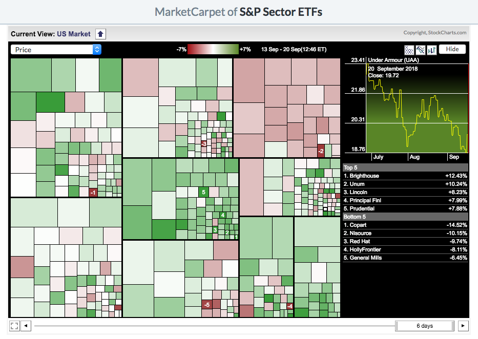
Our S&P Sector MarketCarpet helps avoid that problem by showing all the components that make up each S&P Sector index. By looking at the carpet as a whole, you can get a better sense of the true strength or weakness of each sector.
Here are the steps we recommend when using MarketCarpets for sector rotation analysis:
- Since this is longer-term analysis, we recommend setting the indicator to Change mode and extending the timeframe. In this example, we'll be viewing the Price indicator with a 6-day timeframe.
- Click and hold the center of the date slider and move it slowly left and right to see the change over time. Look for areas of green and red to move about the MarketCarpet within the sector groups.
- Try this process in both Market Cap mode and Square mode (where the squares are equally-weighted) to see whether the sector rotation changes. Differences between these two may indicate that a few large stocks are skewing the performance of the index as a whole.
- Once you have noted any apparent sector rotation with the Price indicator, try switching to Up Days-Down Days or the RSI indicator. Do these other MarketCarpet views confirm the sector rotation you saw with the Price indicator?
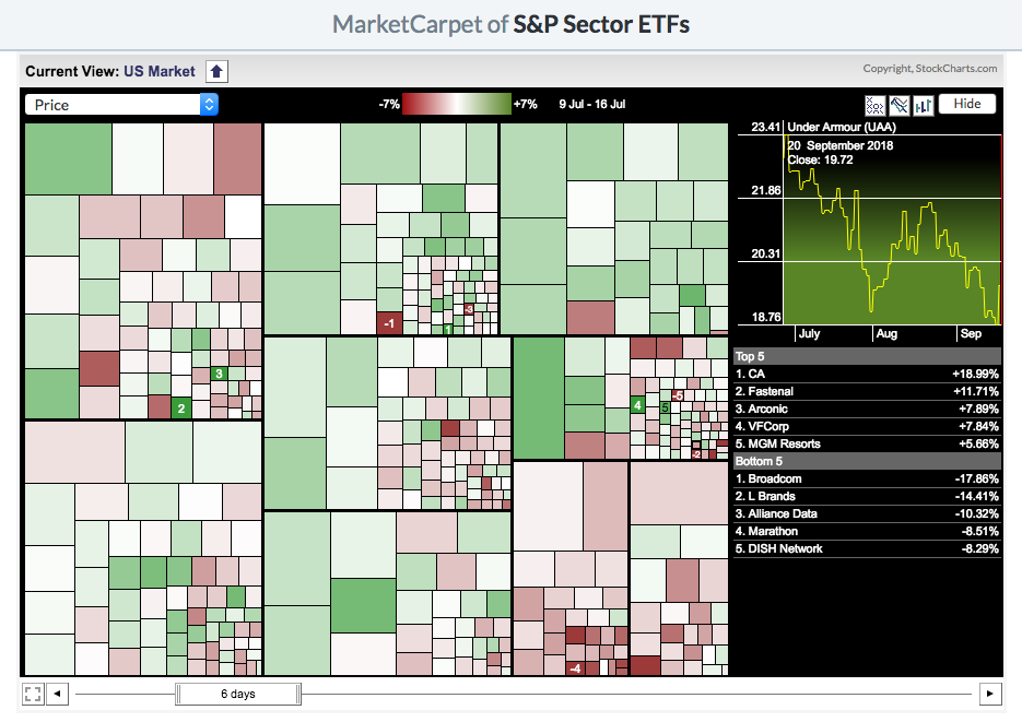
The MarketCarpets below show the Price indicator set to 6-day change mode. The first one shows the values in mid-September, where the Energy and Materials sectors (bottom right) are performing well and the Utilities sector (top right) is struggling. The second carpet shows the values from two months prior, when the opposite was true. In mid-July, the Utilities sector was performing well and the Energy and Materials sectors were struggling.
Conclusion
MarketCarpets are excellent as a visual representation of the performance of all the members of a group, as well as offering a variety of different indicators for measuring that performance. Not only can they be used to pick out the best-performing stocks in a group, MarketCarpets can be used to determine whether there is broad participation in a trend or whether a few members are skewing the performance of the index.
MarketCarpets are highly configurable. A few examples have been presented here, but you should construct your own MarketCarpet to suit your investing style. Please view our Support Center article on MarketCarpets for more detailed information on creating and configuring MarketCarpets.