|
|
Table of Contents
Point & Figure Indicators
Introduction
Chartists can apply moving averages, Bollinger Bands and Volume-by-Price to P&F charts. While the actual formulas remain unchanged, indicators on P&F charts are calculated a little differently than indicators on bar charts. Instead of daily or weekly closing prices as the database, P&F charts use the average price of each column. Despite this difference, chartists can use these indicators much the same way as they are used on bar charts.
Moving Averages
Moving averages on Point & Figure charts are based on the average price of each column. In contrast, bar chart moving averages are based on each period's close. A 10-day SMA on a bar chart would be the average of the last ten closing prices. On a P&F chart, a 10-period SMA would be the average price of the last 10 column averages.
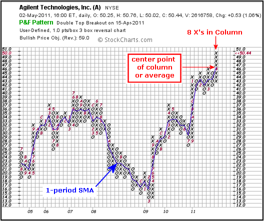
A 1-period SMA provides an easy example for starters. If an X-Column extends from 43 to 50, the 1-period SMA would be 46.5 {(43 + 50)/2 = 46.5}. The chart above shows Agilent with eight X's extending from 43 to 50 in the most recent X-Column. The blue 1-day SMA is currently in the exact middle of that column (between the 4th X and the 5th X).
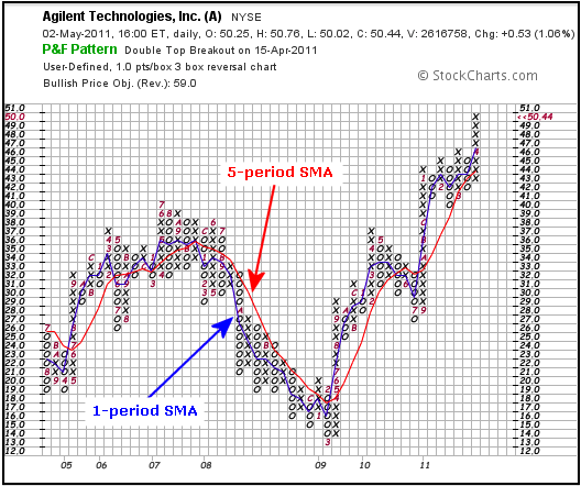
A 5-period SMA on a P&F chart would be the column average for the last five columns. The chart above shows Agilent with a 1-period SMA (blue) and a 5-period SMA (red). Just like bar chart moving averages, these two moving averages lag price. The longer the moving average is, the bigger the lag.
Double smoothing means shorter moving averages can be used. Taking the average of the column smooths price once. A moving average greater than 2-period smooths price a second time. With P&F charts, a 5-period SMA is a 5-period SMA of a 1-period SMA. This double smoothing means chartists can use shorter moving averages with P&F charts. A 5-day SMA on a P&F chart may produce signals similar to a 50-day SMA on a bar chart.
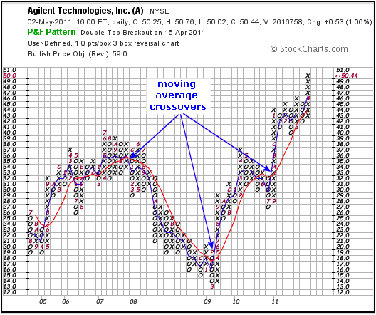
There are at least three possible moving average signals. First, chartists can look for price to cross the moving average. A move above the moving average is bullish, while a move below the moving average is bearish. Second, chartists can identify the direction of the moving average. A rising moving average is bullish and a falling moving average is bearish. Third, chartists can use two moving averages to generate signals. A bull signal is triggered when the shorter moving average crosses above the longer moving average. A bear signal triggers when the shorter moving average crosses below the longer moving average. You can read more on moving averages in our detailed ChartSchool article.
Bollinger Bands
Bollinger Bands are standard deviation bands placed above and below a moving average. Bollinger Bands (20,2) is based on the default setting. 20 periods are used to calculate the moving average and the standard deviation. The upper band is placed 2 standard deviations above the moving average and the lower band is 2 standard deviations below the moving average. Because P&F moving averages are double smoothed, it is often necessary to shorten the moving average period to 10 or even 5. A lot depends on the price characteristics of the underlying security. Some trial and error may be required to find the right fit.
Bollinger Band analysis and signals are the same for both P&F charts and bar charts. There are three basic signals. Narrowing bands indicate a consolidation of sorts that can lead to a breakout - up or down. As with bar charts, this narrowing does not provide a direction clue. Chartists must look for the next P&F signal to establish direction.
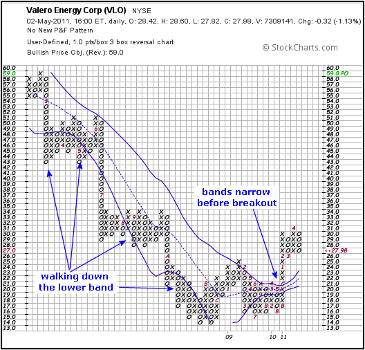
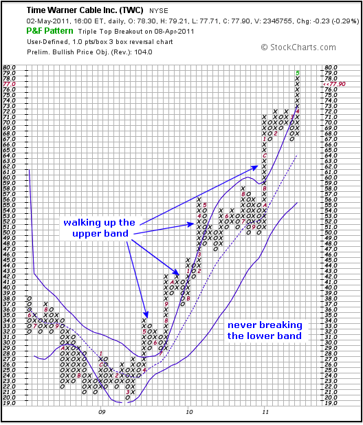
Bollinger Bands provide a natural filter to moving average breaks. Price moves above and below moving averages quite frequently on P&F charts. Chartists can use Bollinger Bands to filter these signals. A 5-period moving average with Bollinger Bands set two standard deviations above and below provides an extra hurdle for prices. A move above the upper band shows strength that is more indicative of an uptrend. Conversely, a move below the lower band shows weakness that is more indicative of a downtrend. Bollinger refers to this as “walking the bands”. You can read more on Bollinger Bands in our detailed ChartSchool article.
Volume-by-Price
Volume-by-Price shows the amount of volume for a particular price range. This is perfect for P&F charts because each box represents a specific price range. Volume-by-Price bars are shown horizontal on the left side of the chart to match the specific price range. This volume is subdivided into positive and negative volume. Volume is positive (green) when price moves higher within the range. Volume is negative when price moves lower within the range.
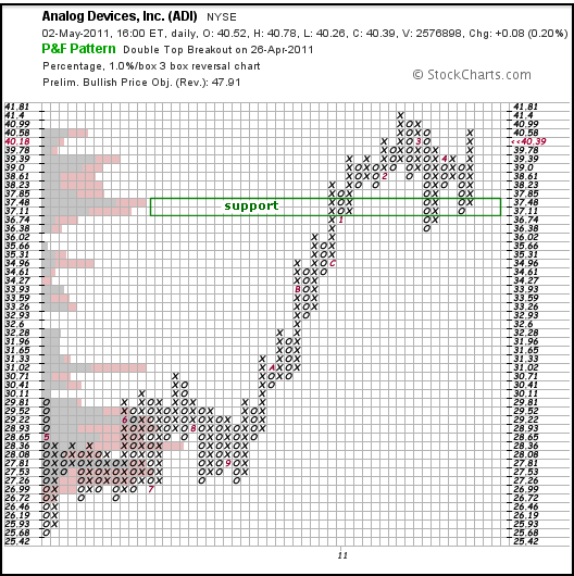
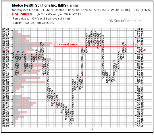
Volume-by-Price can be used to identify support or resistance zones. Long Volume-by-Price bars at or above current prices can be viewed as a potential resistance zone. Conversely, long Volume-by-Price bars at or below current prices can be viewed as a potential support zone. You can read more on Volume-by-Price in our detailed ChartSchool article.
Conclusion
Even though the basic calculations are the same, indicators based on Point & Figure charts are a little different than their bar chart cousins. Chartists new to P&F charts or P&F indicators should take some time to understand and get a feel for how these indicators react to price movements. As with all indicators, it is important to confirm indicator signals with P&F signals. For example, a bullish moving average crossover should be confirmed with a P&F breakout, such as a double or triple top breakout.
Further Study
Thomas Dorsey's Point & Figure Charting examines the basic ideas and key patterns of P&F charts. Dorsey keeps his analysis simple and straightforward; as a relative strength disciple, he devotes a complete chapter to relative strength concepts using P&F charts. These concepts are tied in with market indicators and sector rotation tools to provide investors with all they need to construct a portfolio. Additionally, Dorsey incorporates lessons on how to use P&F charts with ETFs.
The Definitive Guide to Point and Figure, by Jeremy du Plessis, lives up to its title and is required reading for the Chartered Market Technician exam. Chartists can learn about 1-box P&F patterns/counts, 3-box patterns/counts and various trading strategies. du Plessis also shows how to apply P&F charting techniques to other analysis tools, such as relative strength and Fibonacci retracements, using plenty of real-world examples.

