|
|
This is an old revision of the document!
Table of Contents
P&F Scaling and Timeframes
Introduction
Even though intraday charts are normally associated with short-term analysis, chartists may be surprised just how far back intraday data can extend on Point & Figure charts. It is this time extension into the past that determines the analytical timeframe. In general, charts that extend back just one month would be short-term oriented. Charts that extend several months would be mostly medium-term oriented. Charts that extend more than a year would be suited for long-term analysis. The amount of past data shown on a Point & Figure chart is not fixed. Instead, this look-back period is subject to the number of price reversals, which in turn are influenced by box size, reversal amount, and data interval. This article will show a few different P&F settings to help chartists choose the time interval best suited for their analysis.
Scaling Methods
There are four scaling methods available for our P&F Charts: Traditional, Percentage, Dynamic (ATR) and User-Defined.
Traditional
Traditional scaling uses a predefined table of price ranges to determine what the box size should be. The table was originally created by the people at “ChartCraft” and later popularized by Tom Dorsey in his book Point & Figure Charting.
| Price Range | Box Size |
| Under 0.25 | 0.0625 |
| 0.25 to 1.00 | 0.125 |
| 1.00 to 5.00 | 0.25 |
| 5.00 to 20.00 | 0.50 |
| 20.00 to 100 | 1.00 |
| 100 to 200 | 2.00 |
| 200 to 500 | 4.00 |
| 500 to 1,000 | 5.00 |
| 1,000 to 25,000 | 50.00 |
| 25,000 and up | 500.00 |
Percentage Scaling
Percentage-based scaling uses box sizes that are a fixed percentage of the stock's price. For example, if a chart used 5% scaling and the stock's price is $100, the box size for that part of the chart will be $5.00.
User-Defined Scaling
User-Defined scaling allows the user to set a fixed box size for the entire chart.
Dynamic (ATR) Scaling
Dynamic (ATR) scaling calculates the “Average True Range” for the stock over a set period of time and uses that value as the box size for the entire chart.
To keep it simple, the rest of this article will use the Percentage scaling method and a classic reversal amount (3). Percentage scaling means the box size will be a specific percentage of price. Interval refers to the data periods (daily, 60 minute, 30 minute etc…). The box-size and data interval will be changed to affect the look-back period on the P&F chart. Basically, P&F charts with smaller box sizes and shorter data intervals have shorter look-back periods. P&F charts with larger box sizes and longer data intervals have longer look-back periods.
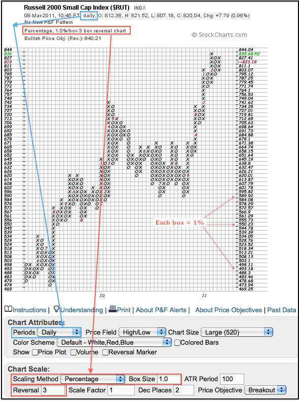
The Russell 2000 P&F chart shows the key settings in the Chart Attributes section and the Chart Scale section. Notice how the numerical value of each box changes. The difference between the top two boxes is 8.36 (844.04 - 835.68) and the difference between the bottom boxes is 4.69 (473.94 - 469.25). Despite different sizes in absolute numbers, the boxes are equal in percentage terms (1%). 8.36 is 1% of 835.68 and 4.69 is 1% of 469.25.
Percentage versus User-Defined
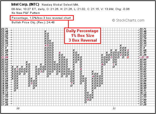
Percentage-based scaling allows a one-size-fits-all setting for a group of charts. Google (GOOG) trades above $600 a share and Intel (INTC) trades below $25 per share. Obviously, a $1 box would produce relatively few reversals for Intel and many for Google. Intel rarely moves more than $2 per week, while Google rarely moves less than $10 per week. Percentage scaling levels the playing field. Setting the percentage box size at 1% means a 1% move in Intel will be around .21 (21 cents) and a 1% move in Google will be worth around 6 (6 dollars). The charts below show Intel with a Percentage box size (1%) and user-defined box size (20 cents).
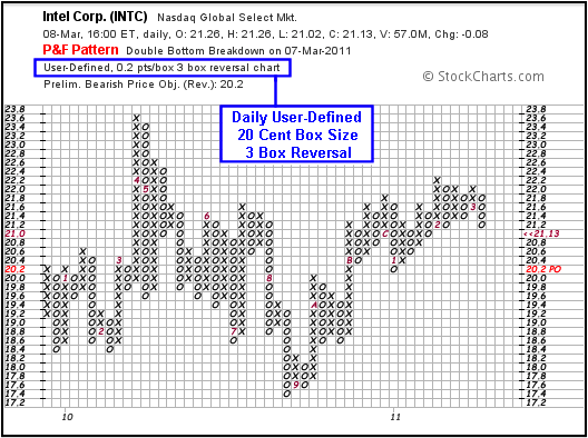
The user-defined scaling method sets the box size at a specific value. No matter how high or low the price, this value stays the same. A box of 1 would be worth 1 point on the S&P 500 and $1 for a stock or ETF. A box worth .50 would be worth a 1/2 point on the S&P 500 and 50 cents for stock or ETF. A smaller box size (.50) will result in more reversals and a shorter look-back period. A larger box size (1.00) will result in fewer reversals and a longer look-back period.
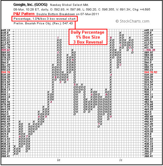
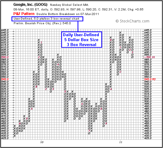
Chartists preferring a set box size can usually set the box size at around 1% of the current price. Intel is trading around 21 and would warrant a box size of 21 cents. Google is trading around 592 and would warrant a box size of $6. These numbers can even be rounded to allow for easier counting. The charts below show Google with a percentage box size (1%) and a user-defined box size of 5 points (Dollars). There are some differences between the percentage chart above and user-defined charts below, but these differences are small and the charts are quite similar overall.
9-24 Month Charts
The amount of time shown on a P&F chart depends on the number of 3-box reversals on the price chart. On a P&F chart with 1% boxes, a 3-box reversal occurs each time the price reverses by 3%. The reversal amount is actually a little above 3% for advances and just below 3% for declines. This is because 3% of 60 (1.8) is more than 3% of 57 (1.71).
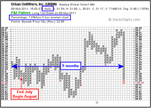
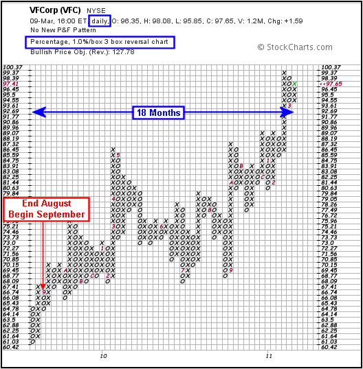
Securities that trade sideways with numerous 3% reversals will fill up the P&F chart quite quickly and cover a shorter timeframe. Securities that develop trends and forge a modest number of 3% reversals will cover more ground (time) on a P&F chart. Generally speaking, a 3-box reversal P&F chart with 1% box size will extend 9-24 months. Increasing the box size will increase the time covered on the chart.
The first P&F chart below shows VF Corp (VFC) based on a 3-box reversal and 1% box size. This chart extends from August 2009 to March 2011 (around 18 months). The red 9 on the far left marks the end of August and beginning of September. The second chart shows Urban Outfitters with the same settings, but the chart extends from July 2010 to March 2011, just nine months.
High-Low Method
Before moving on to intraday data, it is important to understand the difference in P&F pricing methodologies. There are two pricing methods available: the High-Low Method and the Close Method. Each method only uses one price point. Obviously, the Close Method uses the closing price only. The High-Low Method uses the high or the low, but not both. Sometimes both are ignored. Here are the rules for the high-low method.
When the current column is a column of X's (advance):
- Use the high when another X can be drawn and then ignore the low.
- Use the low when another X cannot be drawn and the low triggers a 3-box reversal.
- Ignore both when the high does not warrant another X and the low does not trigger a 3-box reversal.
When the current column is a column of O's (decline):
- Use the low when another O can be drawn and then ignore the high.
- Use the high when another O cannot be drawn and the high triggers a 3-box reversal.
- Ignore both when the low does not warrant another O and the high does not trigger a 3-box reversal.
With only one data point used in the High-Low Method, it is possible to leave some key data on the table, or rather off the chart. Using intraday data helps remedy this issue. There are around 6.5 hours in a normal trading day on the NYSE and Nasdaq. This means there will be 7 sixty-minute periods, 13 thirty-minute periods, 39 ten-minute periods and so on. Using the High-Low Method with intraday periods will capture more price action than the High-Low Method using daily data. A 60-minute chart will use 7 data points per day, even with the High-Low Method. The high-low range for each 60-minute period is used. This means important swings, highs or lows will not be missed.
3-9 Month Charts
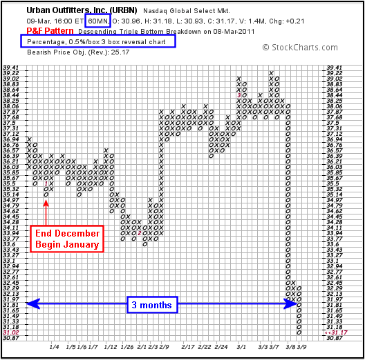
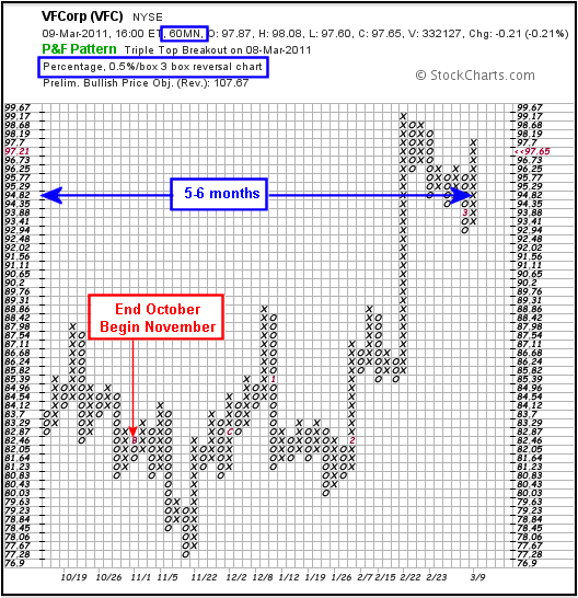
While intraday data is often associated with short-term charts, intraday intervals often produce nice medium-term P&F charts. Of course, the definitions for short-term, medium-term, and long-term depend on your trading or investing style. Moving from a daily to a 60-minute interval and from a 1% box size to a .50% box size will reduce the time covered on the chart and increase sensitivity. In most cases, these charts will extend 3-9 months, which covers the medium-term timeframe for many traders. The P&F charts below show Urban Outfitters and VF Corp based on 60-minute data and .50% per box.
Conclusion
While daily P&F charts are best suited for long-term analysis, intraday intervals are often needed to achieve a medium-term outlook. The next analytical step (short-term) would be to decrease the interval and box size even further. A 15-minute chart using a box size of .25% would cover around one month of data for many securities. Starting analysis with the longest look-back period allows chartists to define the bigger trend. Keep this in mind when moving to shorter periods. Trading results can be improved by looking for short-term bullish setups when the long-term trend is up. The settings shown above are meant as general guidelines. Chartists should configure their own P&F charts to suit their investing style.
