|
|
Table of Contents
Sector Rotation Analysis
Sector Rotation Analysis attempts to link current strengths and weaknesses in the stock market with the general business cycle based on the relative performance of the eleven S&P Sector SPDR ETFs. Once you have identified the strong and weak sectors, you can then compare the results to a theoretical business cycle chart and - hopefully - determine the part of the business cycle the market is in. That information, in turn, may help you predict which sectors will strengthen in the coming weeks and months.
The Business Cycle
The graph below shows the idealized business cycle and the intermarket relationships during a normal inflationary environment. This cycle map is based on one shown in the Intermarket Review by Martin J. Pring (www.pring.com). The business cycle is shown as a sine wave. The first three stages are part of an economic contraction (weakening, bottoming and strengthening). Stage 3 shows the economy in a contraction phase, beginning to strengthen after a bottom. As the sine wave crosses the centerline, the economy moves from contraction to the three phases of economic expansion (strengthening, topping and weakening). Stage 6 shows the economy in an expansion phase, starting to weaken after a top.
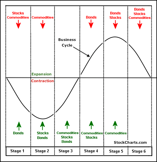
- Stage 1 shows the economy contracting and bonds turning up as interest rates decline. Economic weakness favors loose monetary policy and the lowering of interest rates, which is bullish for bonds.
- Stage 2 marks a bottom in the economy and the stock market. Even though economic conditions have stopped deteriorating, the economy is still not at an expansion stage or actually growing. However, stocks anticipate an expansion phase by bottoming before the contraction period ends.
- Stage 3 shows a vast improvement in economic conditions as the business cycle prepares to move into an expansion phase. Stocks are rising and commodities are anticipating an expansion phase by turning up.
- Stage 4 marks a period of full expansion. Both stocks and commodities are rising, but bonds turn lower because the expansion increases inflationary pressures. To combat this, interest rates start to move higher.
- Stage 5 marks a peak in economic growth and the stock market. Even though the expansion continues, the economy grows at a slower pace because rising interest rates and rising commodity prices take their toll. Stocks anticipate a contraction phase by peaking before the expansion actually ends. Commodities remain strong and peak after stocks.
- Stage 6 marks a deterioration in the economy as the business cycle prepares to move from an expansion phase to a contraction phase. Stocks have already been moving lower and commodities now turn lower in anticipation of decreased demand from the deteriorating economy.
Keep in mind that this is the ideal business cycle in an inflationary environment. Stocks and bonds advance together in stages 2 and 3. Similarly, both decline in stages 5 and 6. This would not be the case in a deflationary environment, when bonds and stocks would move in opposite directions.
Sector Rotation
Unsurprisingly, the business cycle influences the rotation of stock market sectors and industry groups. Certain sectors perform better than others during specific phases of the business cycle. Knowing the stage of the business cycle can help investors position themselves in the right sectors and avoid the wrong ones.
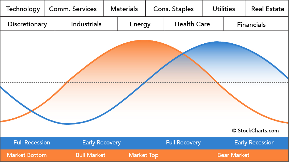
The graph above shows the economic cycle in blue, the stock market cycle in orange and the best performing sectors at the top. The blue economic cycle corresponds to the business cycle shown above. The centerline marks the contraction/expansion threshold for the economy. Notice how the orange market cycle leads the business cycle. The market turns up and crosses the centerline before the economic cycle turns. Similarly, the market turns down and crosses below the centerline ahead of the economic cycle.
The technology sector is the first to turn up in anticipation of a bottom in the economy. Consumer discretionary stocks are not far behind. These two groups are the big leaders at the beginning of a bull run in the stock market.
The top of the market cycle is marked by relative strength in materials and energy. These sectors benefit from a rise in commodity prices and a rise in demand from an expanding economy. The tipping point for the market comes when leadership shifts from energy to consumer staples. This is a sign that commodity prices are starting to hurt the economy.
The market peak and downturn are followed by a contraction in the economy. At this stage, the Fed starts to lower interest rates and the yield curve steepens. Falling interest rates benefit debt-laden utilities and business at banks. The steepening yield curve also improves profitability at banks and encourages lending. Low interest rates and easy money eventually lead to a market bottom and the cycle repeats itself.
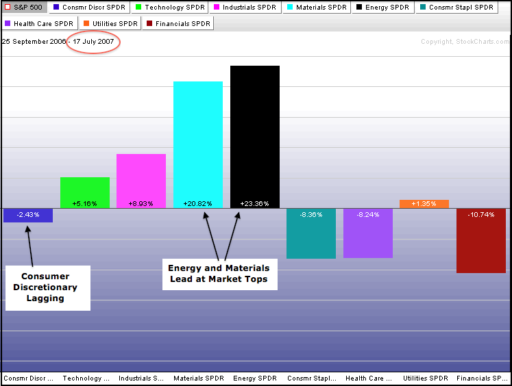
The two sector PerfCharts below show relative performance for the (at that time, nine) sector SPDRs near the 2007 peak and after the 2003 bottom. The S&P 500 peaked from July to October 2007 and broke down in the fourth quarter of that year. In the summer of 2007, the energy and materials sectors were leading the market and showing relative strength. Also, notice that the consumer discretionary was lagging the S&P 500. This sector action matches what is expected at a market top.
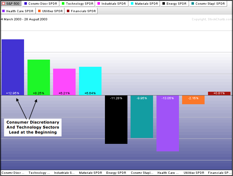
The S&P 500 bottomed in March 2003 and began a powerful bull run that lasted until the peak in the summer of 2007. The consumer discretionary and technology sectors led the first move off the March 2003 low. These two showed relative strength that affirmed the importance of the 2003 bottom.
Staples/Discretionary Ratio
Chartists can also compare the performance of the consumer discretionary sector to the consumer staples sector for clues on the economy. Stocks in the consumer discretionary sector represent products that are optional. These industry groups include apparel retailers and producers, shoe retailers and producers, restaurants and autos. Stocks in the consumer staples sector represent products that are necessary, such as soap, toothpaste, groceries, beverages, and medicine. The consumer discretionary sector tends to outperform when the economy is buoyant and growing. This sector underperforms when the economy is struggling or contracting.
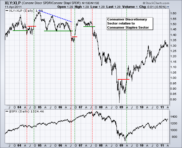
Chartists can compare the performance of these two with a simple ratio chart of the Consumer Discretionary SPDR (XLY) divided by the Consumer Staples SPDR (XLP). The chart above shows this ratio with the S&P 500. The ratio was rather choppy in 2004, 2005 and 2006. A strong downtrend took hold in 2007 as the consumer discretionary sector underperformed the consumer staples sector. Put another way, the consumer staples sector outperformed the consumer discretionary sector. Also, notice that this ratio peaked ahead of the S&P 500 in 2007 and broke support ahead of the market. The ratio bottomed ahead of the S&P 500 in late 2008 and broke resistance as the S&P 500 surged off the March 2009 low.
Conclusions
Additional Resources
Articles
- StockCharts Historical Sector Data - learn how StockCharts provides historical data for analysis of the Real Estate and Communication Services sectors.

