|
|
Table of Contents
DecisionPoint Trend & Condition Charts
Introduction
The first step in the DecisionPoint Analysis Approach is to review the Trend and Condition charts in the DecisionPoint Gallery get a quick, yet thorough, picture of the current state of the market. To review, there are three essential steps to DecisionPoint Analysis: (1) Determine the market trend; (2) Evaluate the market condition; and (3) Identify and initiate actions that are most compatible with the trend and condition of the market. Market Trend is identified by observing moving average trend lines along with their positions and direction. Market Conditions (oversold or overbought) are identified by evaluating the readings of DecisionPoint market indicators. Below is a description of how to use the DecisionPoint Gallery as part of a daily review.
Three-Period Trend Analysis
Trading decisions in one time frame are dependent upon the trend of the next higher time period, so daily, weekly, and monthly based charts are used for trend analysis. To determine the trend, you can draw trend lines, but for an objective definition of trend, use the relationship of a fast and slow exponential moving average (EMAs). When the fast EMA is above the slow EMA, it is bullish, and bearish when it is below. For early warning of possible trend changes watch for PMO and EMA direction changes and PMO crossovers. For a more detailed explanation of DecisionPoint Trend Analysis, a Chart School article is available here.
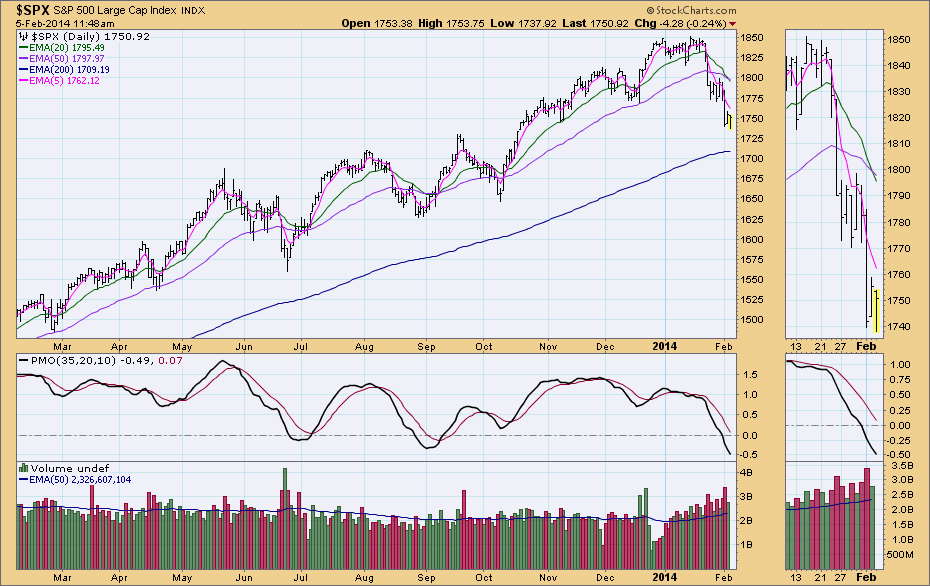
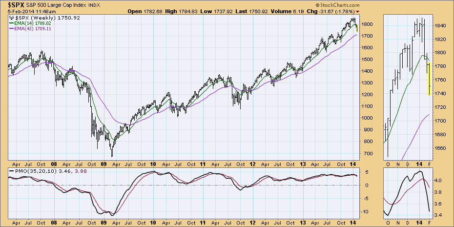
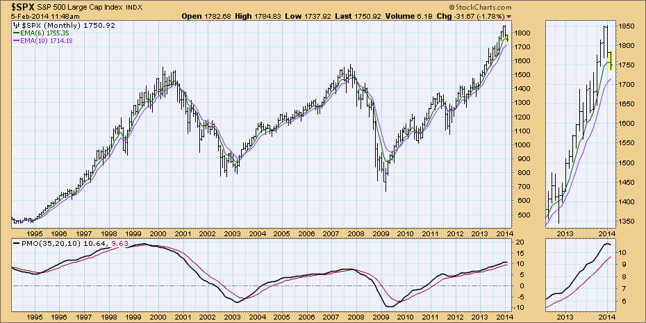
The first three charts identify the trend, daily, weekly and monthly bar charts below. In these charts, look for the configuration of the EMAs and the direction of the PMO.
In the Daily chart, if the 5-EMA is rising, it is short-term bullish. If the 20-EMA is above the 50-EMA, intermediate-term trend is bullish. If the 50-EMA is above the 200-EMA it is long-term bullish. The opposite holds true for bearish configurations with one exception. If the 20-EMA crossed below the 50-EMA while the 50-EMA was above the 200-EMA, that is considered intermediate-term NEUTRAL. If the PMO is above it's 10-EMA it is bullish. Look for PMO crossovers, relation to the zero line and tops/bottoms to gain insight on price momentum. Click here to read more about the PMO.
In the Weekly chart, if the 14-EMA is above the 43-EMA, it is intermediate-term bullish. If it is below the the 43-EMA, it is bearish. Also, take note as to the configuration of the weekly PMO. If it is above its EMA it is bullish, below it is bearish. If it is rising that is also bullish and if it is falling that is bearish. Remember that the Trend on the weekly chart is another view of the medium- to long-term trend of the market.
The monthly chart presents a macro view of the market. Again, observe the configuration of the 6/10-EMAs and the PMO in relation to its EMA and the zero line.
Three-Period Condition Analysis
The second step to the DecisionPoint Analysis Approach is to determine market condition. What is meant by the “condition of the market, is it being overbought (OB) or oversold (OS). Think of buying and selling as being like alternating manic and depressive phases that cause the zigzag progress of price indexes. First, buyers overwhelm sellers in a wave that drives prices up. Then buying pressure becomes exhausted and the market is described as being overbought. Next, profit taking and selling begin as the sellers take control, and prices are pulled back down until selling reaches a point of exhaustion and the market is oversold. When these alternate pressures are about equal, the market moves sideways, otherwise, the rising or falling trend tells us whether buyers or sellers are the dominant group. By using certain indicators, an assessment of the OB/OS condition of the market can be made to get some clue as to when price reversals may occur. Just as with trend analysis, the condition of the market is reviewed in the short-, intermediate-, and long-term time frames; the indicators are designed to detect the condition of each of those time frames. The object of this analysis is to identify optimum points for entry or exit within the trend, or to simply be aware of conditions that demand more caution. For example, if the market becomes overbought in an intermediate-term up trend, more caution should be taken regarding current market exposure, and it would not be considered an optimum time to open new longs. If the market were oversold in the same up trend, anticipate an upward shift in price momentum and be looking for opportunities to increase market exposure.
Ultra-Short Term
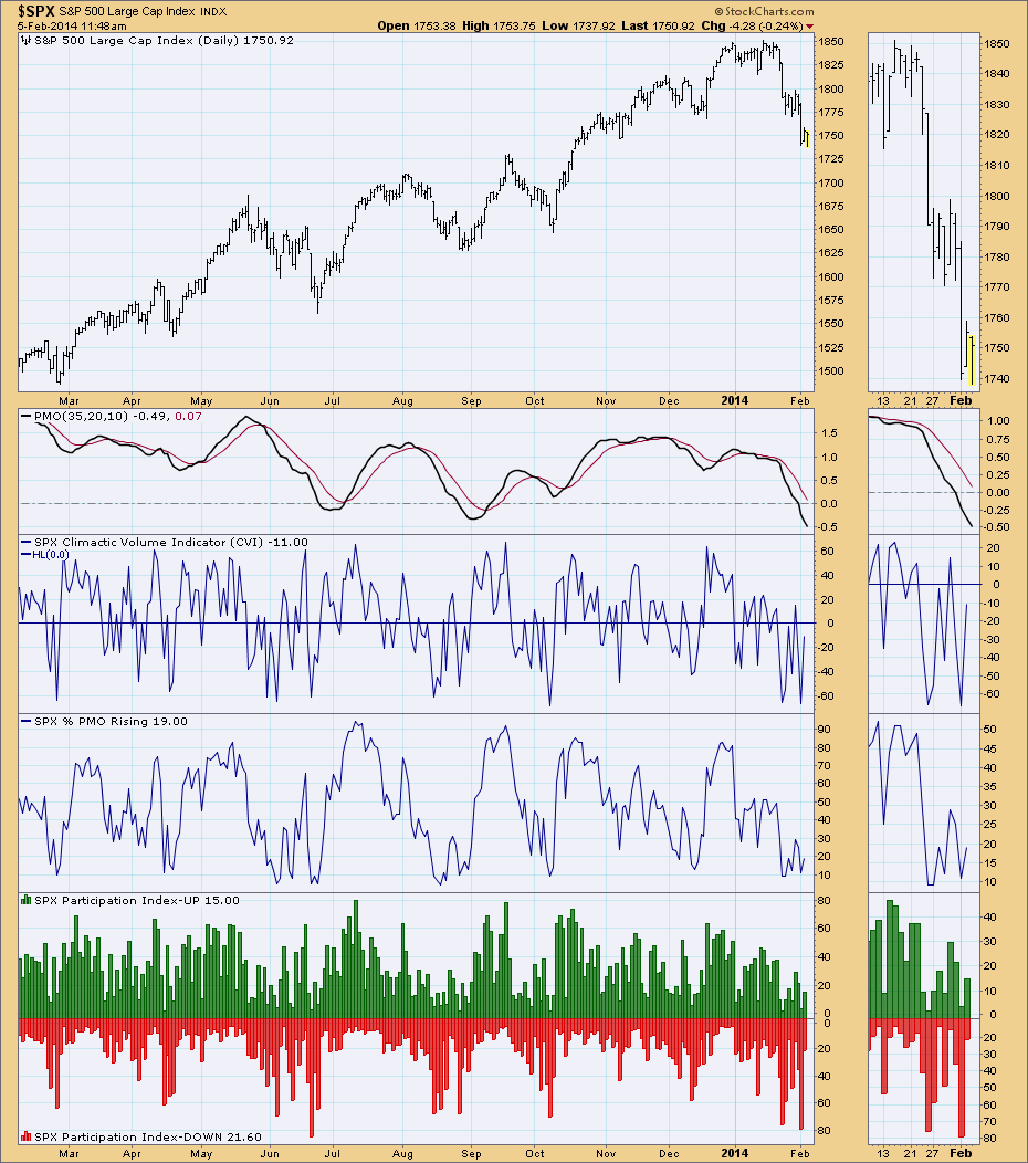
There are two ultra-short-term charts. In all of them, look for “climactic” activity, spikes, extremely high or low readings. These show us two things, whether the market is ultra-short-term overbought or oversold and if the market is hitting an exhaustion or initiation climax. Generally these indicators are volatile and oscillate frequently.
In the first chart, the CVI is part of the On-Balance Volume Suite of indicators (click here to read more). Look for it to reach overbought or oversold extremes. The Percent PMO Rising is the calculation of how many stocks in the referenced index have momentum rising. The final indicator is the Participation Index - UP and DOWN, this visually shows how UP participation, the number of stocks actually driving the up move, expands as the market moves higher, then contracts prior to short-term market tops. A similar thing can happen with DOWN participation as the market is about to bottom.
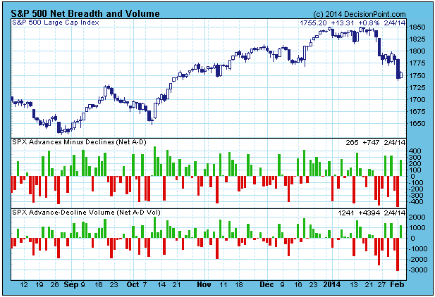
In the second chart, is Net Breadth and Volume. This chart gives us a quick visual regarding the conviction behind the day's buying or selling. Comparatively high or low readings will suggest that a price move may have exhausted its strength in the very short term. Again we are looking for extremely high or low readings to help evaluate ultra-short-term.
Short-Term
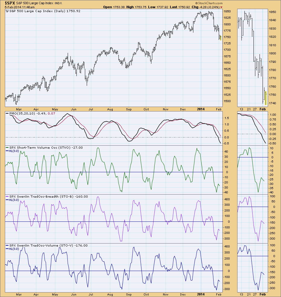
There are two short-term condition charts reviewed. Identifying extreme readings help to determine whether the market is overbought or oversold in the short term. Overbought (high) readings generally portend a market top whereas oversold (low) readings conditions can indicate a market bottom is nearing. Divergences between price and indicators can also gauge when the market is showing weakness or strength.
Look at the readings of the STVO, STO-B and STO-V in the chart below and note their positions in relation to the zero line and the top and bottom of their ranges. As with most indicators the primary trend of the market will determine how you will use the indicator. In a bull market, tops may not be very reliable. In a bear market bottoms may not be very reliable. Additionally, with the STO-B and STO-V, we can compare the breadth and volume versions, looking for divergences. Such inconsistencies are warnings that the price trend is not fully supported by breadth and volume.
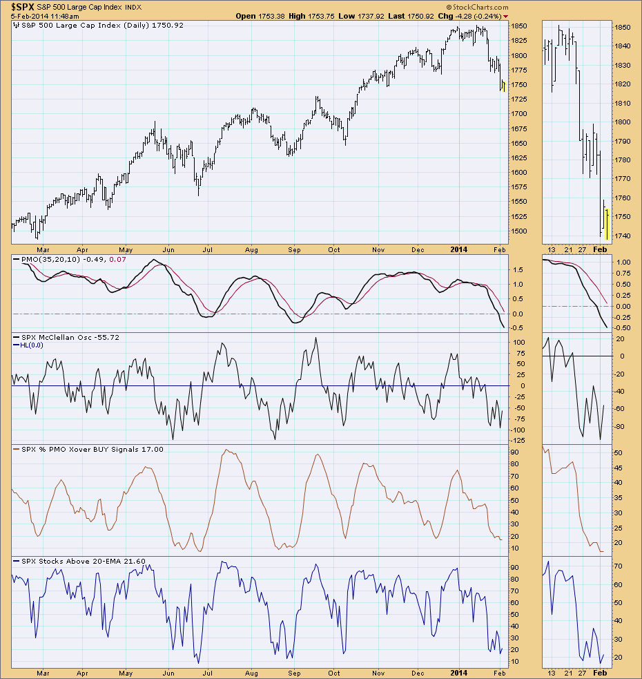
The second short-term condition chart positions another three short-term indicators together: McClellan Oscillator, Percent PMO BUY Signals and Stocks Above Their 20-EMA. For more information on the McClellan Oscillator, you can review the Chart School article here. The Percent PMO BUY Signals is the percentage of stocks in that particular index (in the case of the DecisionPoint Gallery, the SPX) that are on PMO BUY signals. In this chart, observe the placement of the McClellan Oscillator in relation to the zero line, direction it is moving and extremes in its range. In the case of the other two indicators, extreme overbought/oversold conditions are when these percentages hover around 90% and above or 10% and below.
Intermediate-Term
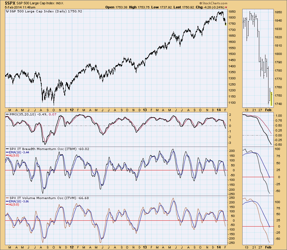
The primary intermediate-term indicators in DecisionPoint analysis are the ITBM and ITVM. To read more about these particular indicators, click here for the Chart School article. Market condition is determined not only by extreme readings, but also by whether each indicator has crossed above or below its EMA. If the indicator tops below its EMA with no crossover or crosses below its EMA, it is bearish. Likewise, if the indicator bottoms before crossing below its EMA or it crosses above its EMA, it is bullish.
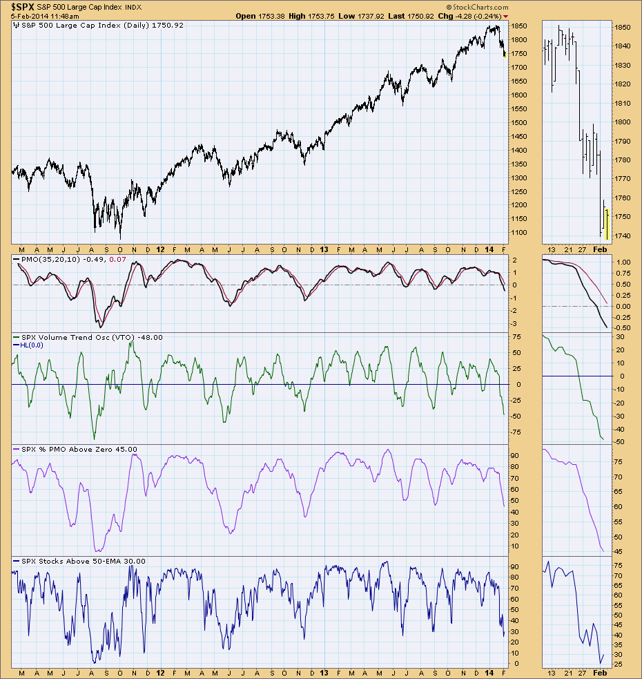
The secondary intermediate-term indicators are the Volume Trend Oscillator (VTO), Percent PMO Above Zero and Percent Stocks Above Their 50-EMA. The VTO is part of the On Balance Volume Suite of indicators, you can read more about this indicator in Chart School here. As the titles indicate, the 2nd indicator is the percentage of stocks in that index (in the case of the Gallery, the SPX) whose value is above zero. In the case of all these indicators, extreme readings in either direction demonstrate that intermediate-term market conditions are either overbought or oversold. The direction of each indicator can mean internal strength or weakness in that index.
Conclusion
Before even thinking of buying or selling, it is necessary to know the trend and condition of the market. It is extremely powerful to know how the tide is running so that actions taken will ride on the tide, not struggle against it. Even at the stock selection stage, overall knowledge of market conditions will provide feedback to the correctness of your analysis.
The entire top to bottom analysis process should be done every day, so as to develop a strong intuition about what is happening in the market and in the list of trading vehicles that are being tracked in a particular sector or index.
