|
|
Table of Contents
High-Low Percent
What Is the High-Low Percent?
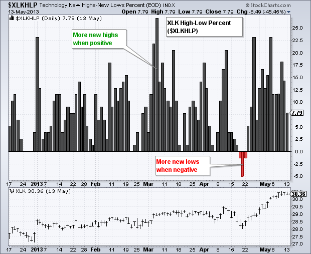
The High-Low Percent is a breadth indicator that measures the percentage of net new highs. After the market close, StockCharts.com calculates this indicator for the nine sector SPDRs and several indexes. High-Low Percent can be plotted independently or used to create the High-Low Line. These indicators can then complement the analysis of the underlying security. For example, the High-Low Line based on High-Low Percent for the Technology SPDR (XLK) would complement the analysis of XLK. This article will explain how to use this indicator and show SharpChart examples. You can find a sample list of symbols at the end of this article.
Calculating the High-Low Percent
StockCharts.com has High-Low Percent data going back at least three years. Note, however, that these calculations are based on the list of stocks in the underlying index or exchange-traded fund (ETF), such as XLK, which do change. This means the breadth data from two years ago is based on the then-current holdings, which may be different from the present-day holdings. Even though the holdings for the nine sector SPDRs and indexes are relatively stable, chartists should consider this when using a long-term chart.
High-Low Percent = (52-week Highs Less 52-week Lows)/ Total Issues
High-Low Percent = (15  -  2) / 77 = +13/77 = +16.88%
High-Low Percent = (2  -  6) / 77 = -4/77 = -5.19%
High-Low Percent fluctuates between -100% and +100% with zero as the middle line. In reality, extreme readings, greater than +70% and less than -70%, are very rare and the actual range is much smaller.
In the numerical example above, the Technology SPDR has 77 stocks with 15 new highs and two new lows. High-Low Percent is positive (+16.88%) because there are more new highs than new lows. In the second example, there are 2 new highs and 6 new lows. High-Low Percent is negative (-5.19%) because there are more new lows than new highs.
Interpreting the High-Low Percent
As a breadth indicator, High-Low Percent is a lagging indicator that helps define the medium- to long-term trend. It takes 52 weeks to produce a new high or a new low. New highs expand after an extended move in the broader market (S&P 500) and remain strong as long as the uptrend extends. New highs may dry up with the first decline or sideways consolidation, but a surge in new lows is unlikely after just a few weeks. It takes an extended decline or major support break to trigger an expansion of new lows. Chartists can look at High-Low Percent as a stand-alone indicator or create a High-Low Line to identify turning points.
High-Low Line
The High-Low Line is a cumulative measure of each period's High-Low Percent value. The High-Low Line rises when High-Low Percent is positive and falls when High-Low Percent is negative. The values on the right-hand scale are not important because these values depend on the starting date. Chartists should simply focus on the line's movements and general direction. It is also possible to apply a moving average or other indicators to the High-Low Line.
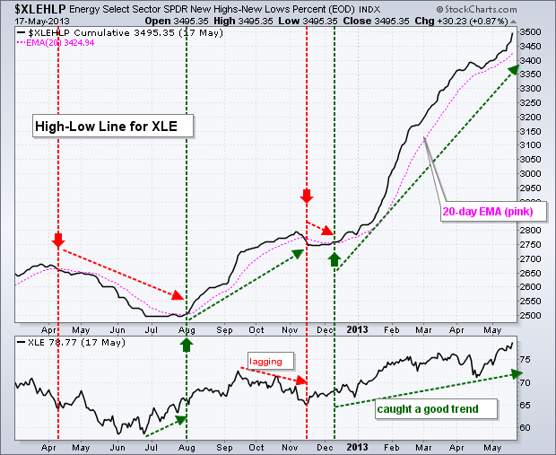
The chart below shows the XLE High-Low Line with a 20-day EMA in the main window and the Energy SPDR (XLE) in the lower window. As noted above, High-Low Percent is a lagging indicator that usually turns after the trend has turned. Some signals will be timely and result in good trades, but others will lag and produce whipsaws if a trend quickly reverses.
Click here for a live version of the chart.
Let's look at some of the signals. First, notice how the High-Low Line declined from early April to late June before then flattening out. XLE turned up in July, but the High-Low Line did not turn up and break its 20-day EMA until August 1st. Second, XLE then turned down in October and the High-Low Line followed with a downturn in mid-November (lagging). This downturn did not last long as the High-Low Line turned back up in mid-December. Third, notice that the December upturn lasted more than six months as the indicator caught a good trend.
High-Low Percent
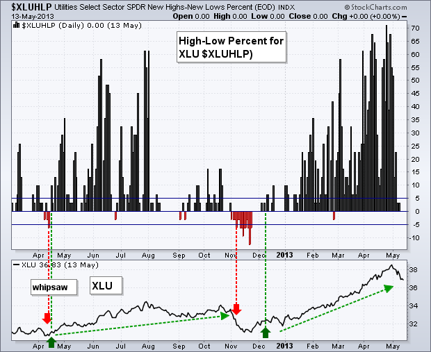
Chartists can also plot High-Low Percent as an indicator on its own. The chart below shows High-Low Percent for the Utilities SPDR (XLU) in the main window and XLU in the lower window. Notice how High-Low Percent fluctuates between -15% and +72%. This range is large because utilities are a rather homogeneous group and XLU has less than 40 stocks.
Click here for a live version of the chart.
Chartists can look for crosses above/below the zero line to establish their trading bias or use a bullish/bearish threshold. In this example, a move above 5% is deemed bullish, while a move below -5% is deemed bearish. These thresholds reduce the number of signals and whipsaws. Signals look great when a strong trend emerges, but there will also be late signals because of the lag. Keep this in mind when using High-Low Percent.
The Bottom Line
High-Low Percent is a breadth indicator that chartists can use to define the path of least resistance or to identify trend changes. In its simplest form, the path of least resistance is up when there are more new highs than new lows. The path is down when new lows outnumber new highs. Remember that High-Low Percent is a lagging indicator; changes in this indicator usually happen after the trend in the underlying index, or ETF has reversed.
SharpCharts
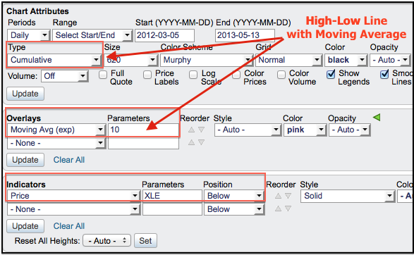
High-Low Percent can be added to any SharpChart using the appropriate symbol (see list below). Chartists can easily create a High-Low Line by using “cumulative” for chart type. A moving average can be added as an “overlay” and the underlying security (XLK) can be shown in a window above or below the main chart window. Click here for a live example.
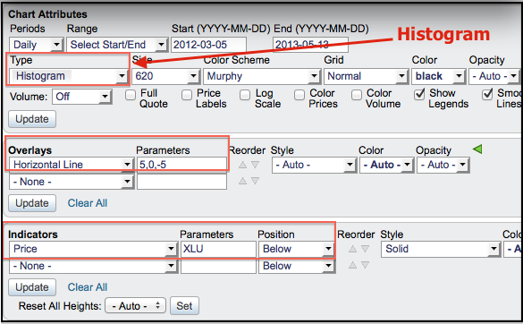
High-Low Percent can be shown on its own as a “histogram” by selecting this option in the Chart Attributes/Type section. This makes it easy to see the zero line and analyze the fluctuations. Chartists can add horizontal lines using the “overlays” section and show the underlying security in the window above or below the main window. Click here for a live example.
Symbol List
StockCharts.com users can access an up-to-date list of symbols for all our High-Low Percent Indicators. From this list, click the “Mentions” icon to the right of a specific symbol for more details about the symbol, as well as recent mentions in Public ChartLists, blog articles, and more.

