|
|
Table of Contents
McClellan Oscillator
Introduction
Developed by Sherman and Marian McClellan, the McClellan Oscillator is a breadth indicator derived from Net Advances, which is the number of advancing issues less the number of declining issues. Subtracting the 39-day exponential moving average of Net Advances from the 19-day exponential moving average of Net Advances forms the oscillator. As the formula reveals, the McClellan Oscillator is a momentum indicator that works similar to MACD. McClellan Oscillator signals can be generated with breadth thrusts, centerline crossovers and divergences.
Ratio-Adjusted
The McClellan Oscillator at StockCharts.com is ratio-adjusted to take into account the changing totals in issues traded on the NYSE and Nasdaq. Instead of using Net Advances, StockCharts.com calculates Net Advances as a percentage of advances plus declines. The result is then multiplied by 1000 to obtain whole numbers and eliminate decimals. This ratio adjustment makes it possible to compare McClellan Oscillator levels over a period of time. The NYSE traded just over 2000 stocks in 1990 and 1991. The total surged throughout the 90s and exceeded 3000 in 1995. Between 1998 and 2010, the NYSE traded between 3000 and 3600 stocks on a daily basis. Ratio-adjusted net advances (RANA) normalizes the indicator by showing net advances as a percentage of advances plus declines, allowing it to be compared across timeframes.
Calculation
Ratio-Adjusted Net Advances (RANA): (Advances - Declines)/(Advances + Declines)

McClellan Oscillator: 19-day EMA of RANA - 39-day EMA of RANA

19-day EMA* = (Current Day RANA - Prior Day EMA) * .10 + Prior Day EMA)
39-day EMA* = (Current Day RANA - Prior Day EMA) * .05 + Prior Day EMA)

* The first EMA calculation is a simple average.
As the table below shows, Net Advances ranged from +2293 to -1806 in July 2010. Ratio-adjusted net advances (RANA) ranged from +753 to -595. Remember, the initial ratios were multiplied by 1000 to eliminate the decimals. This means that +753 equals +75.3% Net Advances and -595 equals -59.5% Net Advances. Exponential moving averages were then created from ratio-adjusted net advances (RANA) and the McClellan Oscillator is simply the 19-day EMA less the 39-day EMA.
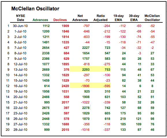
Click here to download this spreadsheet example.
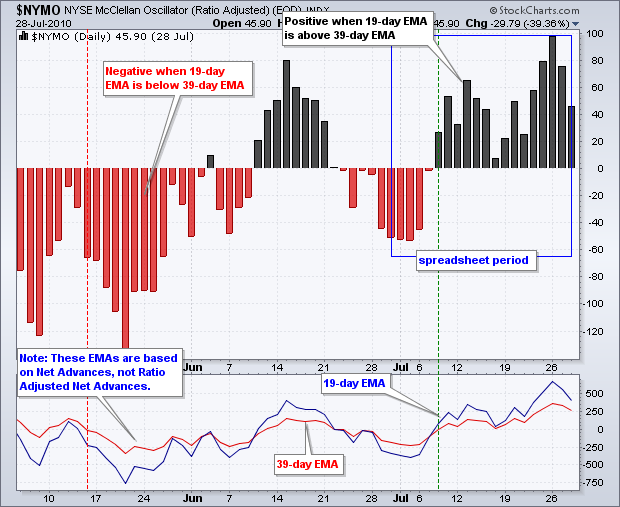
Calculation Note: The 19-day EMA and 39-day EMA in the chart above are based on Net Advances divided by total issues ($NYAD:$NYTOT). This ratio was not multiplied by 1000 and left in its original decimal format.
Interpretation
Think of the McClellan Oscillator as the MACD for the AD Line, which is a cumulative measure of Net Advances. Just as MACD puts momentum into the price plot of a stock, the McClellan Oscillator puts momentum into the AD Line. The McClellan Oscillator is positive when the 19-day EMA (shorter moving average) is above the 39-day (longer moving average) EMA. This signals that advances are gaining the upper hand. Conversely, the indicator is negative when the 19-day EMA is below the 39-day EMA. This signals that declining issues are dominating. Signals typical for MACD apply to the McClellan Oscillator. First, the McClellan Oscillator generally favors the bulls when positive and the bears when negative. Second, chartists can look for bullish and bearish divergences to anticipate reversals. Third, chartists can look for breadth thrusts to signal the start of an extended move.
Positive vs. Negative
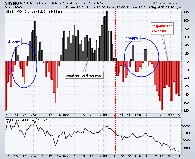
Even though the McClellan Oscillator can be quite volatile, it can also remain positive or negative for extended periods during a strong uptrend or downtrend. Because the NYSE McClellan Oscillator ($NYMO) is based on NYSE stocks, the following example uses the NY Composite as the base index for comparison. On the chart below, the McClellan Oscillator moved into positive territory in late November (2008) and remained positive for around six weeks. This string of positive values corresponded with an uptrend in the NY Composite. The advance ended when the McClellan Oscillator turned negative during the second week of January. There were two small blips into positive territory and then an extended period of negative values in February (four weeks). In reality, these small blips were quite weak because neither exceeded +50 and neither lasted more than two days. Selling pressure intensified in mid-February as the McClellan Oscillator moved below its January lows.
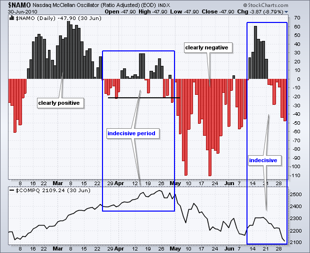
The next chart shows the Nasdaq McClellan Oscillator ($NAMO) with the Nasdaq in the lower window. There are four distinct periods on this chart: two indecisive, one positive and one negative. In the first period, the McClellan Oscillator was clearly positive from the second week of February until the fourth week of March. Notice how it surged above +50 in late February and stayed positive into late March. In the second period, the indicator turned indecisive from the fourth week of March until the second week of May. There were several crosses above/below the zero line. Notice that the indicator did not exceed +30 on the upside or -30 on the downside. There was not much conviction either way. The third period starts with a decisive move below the prior lows as the McClellan Oscillator plunges below -100. This strong selling pressure signaled the start of an extended decline and the oscillator remained largely negative until mid-June. The chart ends with the fourth period, which is another period of indecision as the oscillator fluctuated above/below zero without much conviction.
Breadth Thrusts
A breadth thrust occurs when the McClellan Oscillator surges from deep negative readings to strong positive readings. Typically, the indicator will move from below -50 and exceed +50 for a +100 point thrust. A breadth thrust signals a surge in bullish breadth that can lead to an extended advance. Not all breadth thrusts foreshadow extended advances, but most important lows are marked by a sharp surge in breadth. A bullish breadth thrust is enhanced when preceded by a bullish divergence.
The chart below shows the Nasdaq McClellan Oscillator during the March 2009 bottom. Notice how the McClellan Oscillator formed a bullish divergence and then surged more than 150 points (-80 to +80). This surge reflected strong buying pressure that marked an important low. Think of it as a rocket on lift off. A strong surge is needed to solidify a low and escape the gravity of selling pressure.
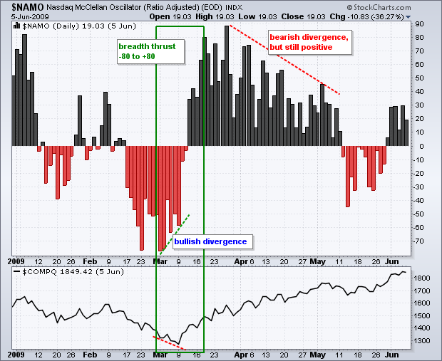
Also, notice that the Nasdaq continued higher as the McClellan Oscillator formed an extended bearish divergence from late March until early May. Lower highs after a breadth surge are normal. One cannot expect the oscillator to remain exceptionally strong (above +50) and continue forging higher highs after such a breadth surge. It is sufficient for the McClellan Oscillator to simply remain positive to keep the bulls going.
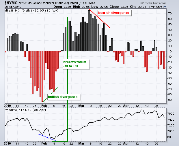
The next chart shows the McClellan Oscillator foreshadowing a bottom in February. The McClellan Oscillator hit its low in late January, but the NY Composite moved to a new low in early February. With the McClellan Oscillator forming a higher low, a bullish divergence formed ahead of the breadth thrust. The bullish divergence warned of a possible trend reversal, which was confirmed by the breadth thrust from -70 to +50 (+120). The McClellan Oscillator peaked in early March and formed a bearish divergence, but the NY Composite continued higher into mid-April.
Divergences
Bullish and bearish divergences in the McClellan Oscillator can foreshadow reversals in the underlying index. However, chartists should not look too hard for such divergences. There will be many divergences and most will not result in reversals or extended moves.
The key, as always, is to separate robust divergences from weak divergences. First, a divergence should be confirmed with a strong supporting move. A bullish divergence is confirmed with a strong move into positive territory. A bearish divergence is confirmed with a strong move into negative territory. Second, divergences should be sharp. The difference between the reaction highs or lows should be noticeable, not negligible.
The chart below shows the Nasdaq McClellan Oscillator with a sharp bearish divergence in October 2007. Even though the Nasdaq moved to a new high in October 2007, the McClellan Oscillator formed a sharply lower high that was barely positive. The subsequent move into negative territory in early November showed a significant increase in selling pressure.
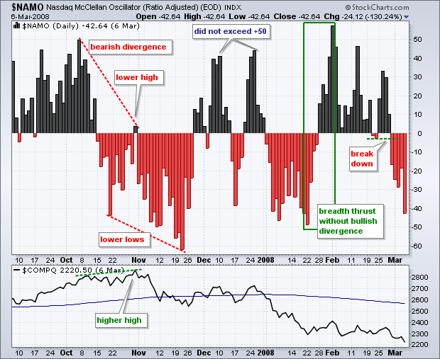
There are also some other signals and non-signals worth reviewing on this chart. Even though the McClellan Oscillator surged from positive to negative territory in November-December, the positive surge did not exceed +50. In other words, it was not strong enough to qualify as a bullish breadth thrust. There was a bullish breadth thrust in January-February, but this thrust was not preceded by a bullish divergence. The oscillator subsequently formed lower highs in February and then broke down in March. Also, notice that the Nasdaq did not move higher in February to confirm the breadth thrust.
Conclusions
The McClellan Oscillator measures the momentum of the AD Line or Net Advances. As a momentum oscillator, it is prone to the pitfalls of normal momentum oscillators, such as MACD. Bearish and bullish divergences can produce some great signals, but these signals are certainly not fail-proof. The same is true for breadth thrusts and crosses into negative or positive territory. Like MACD, the McClellan Oscillator is a rather volatile indicator that produces many potential signals. Signals should be confirmed or refuted with other technical indicators and chart analysis. Chartists can also study past behavior to get a better handle on future behavior.
SharpCharts
SharpCharts users can plot the ratio-adjusted McClellan Oscillator for the NYSE McClellan Oscillator ($NYMO) or the Nasdaq McClellan Oscillator ($NAMO). Users can also plot the un-adjusted McClellan Oscillator for the NYSE ($NYMOT) and Nasdaq ($NAMOT). The unadjusted McClellan Oscillators are based on Net Advances (as opposed to ratio-adjusted Net Advances).
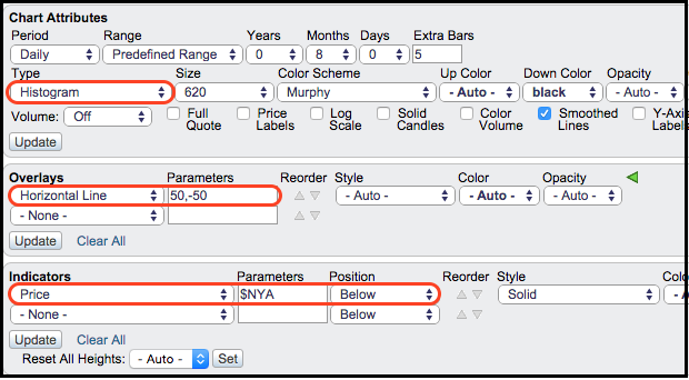
These indicators can be shown in the main chart window or in indicator windows above or below the main window. The example below shows the NYSE McClellan Oscillator as a histogram plot in the main chart window with the NY Composite in the indicator window below. Just select “Histogram” as a chart “Type.” Click here for a live example.
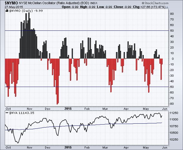
Chartists can also add horizontal lines as an overlay to help identify key levels. Two levels can be added by separating the values with a comma in the parameters box (50,-50). The underlying index can be added in an indicator window below the main window. Select “price” and then enter the symbol in the “Parameters” box.
