|
|
Pring's Inflation and Deflation Indexes
Developed and maintained by Martin Pring, the Pring Inflation and Deflation Indexes (!PRII and !PRDI) seek to replicate a group of stocks that are sensitive to inflationary and deflationary conditions. Individual industry groups can be affected by abnormal situations over a specific cycle, which is why several groups are combined into one index. In this way, distortions affecting a single industry can be minimized.
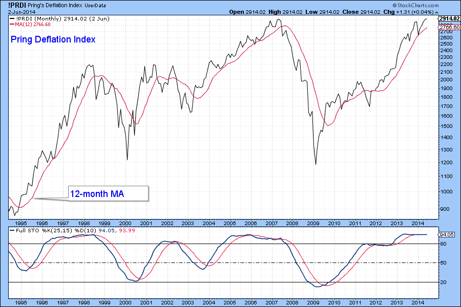
Deflation-sensitive stocks include industry groups such as banks, insurers utilities and so forth. These equities tend to outperform when economic conditions are either weak or in the early phase of a recovery and represent the components of the Pring Deflation Index plotted in Chart 1.

Chart 1
Click here for a live version of the chart.
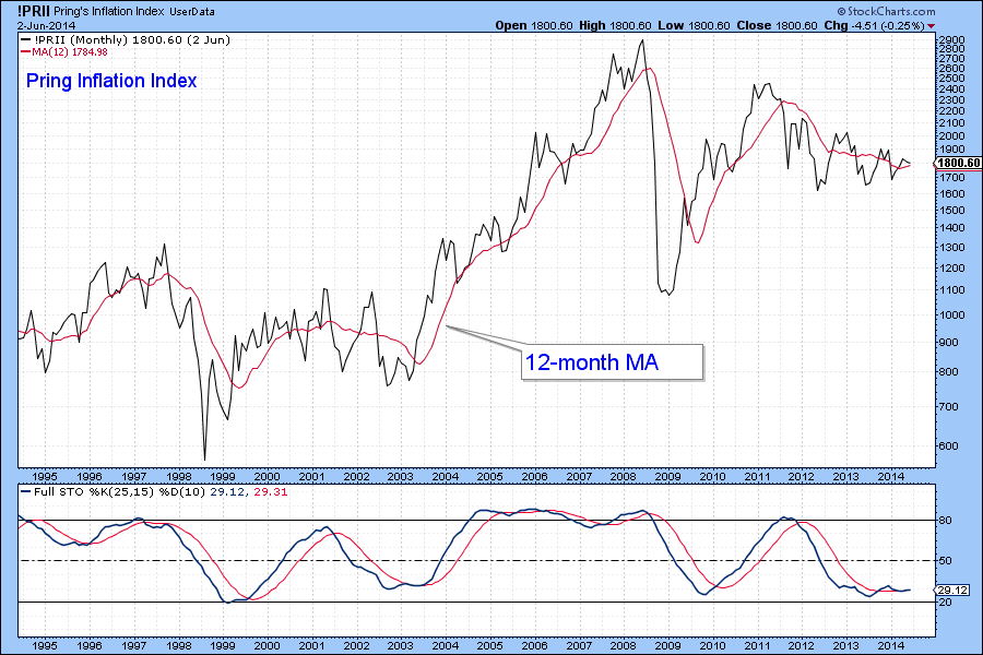
The Pring Inflation Index, Chart 2, comprises mines and energy stocks. These are equities that benefit from rising commodity prices. Both series are best used in conjunction with a long-term smoothed oscillator since the raw series are quite volatile. For this purpose one could use the KST or, as shown here, a 25/15/10 Stochastic. The use of momentum is helpful because both series are quite cyclical in nature; the momentum acts as a guide to the direction and maturity of the primary trend.

Chart 2
Click here for a live version of the chart.
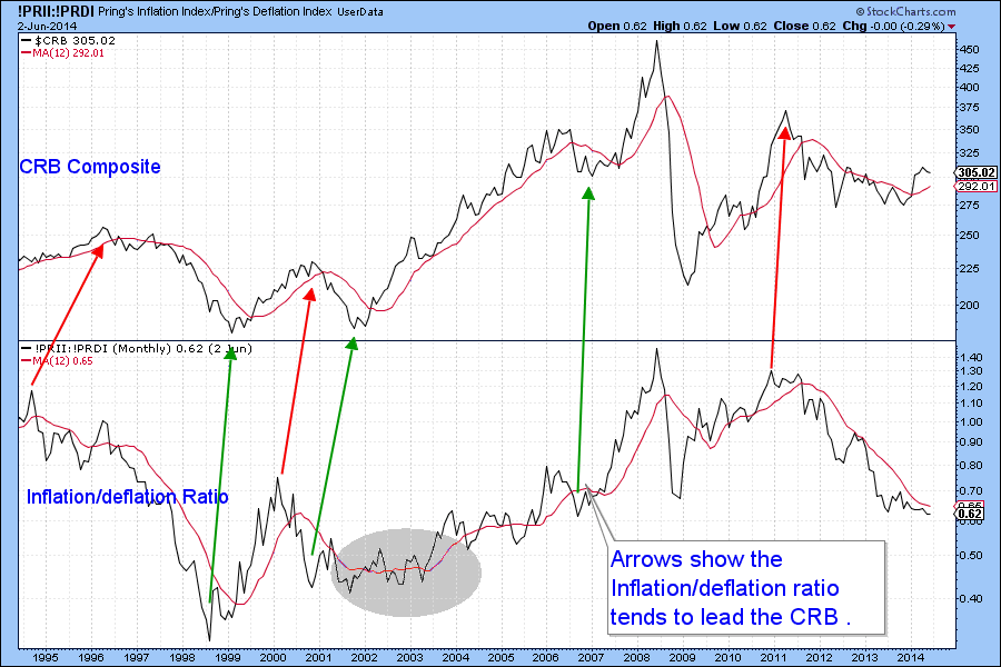
These indexes are best used by plotting a ratio between them known as the Inflation/Deflation Ratio. The StockCharts formula for this would be !PRII:!PRDI. It is featured in Chart 3.

Chart 3
Click here for a live version of the chart.
A rising ratio is inflationary, while a declining ratio indicates a deflationary environment. The chart clearly shows that there is a correlation between what the stock market is saying and what commodities (in the form of the CRB Composite) are actually doing. Note that, in many cases, the ratio leads the commodity market at both peaks and troughs. However, this is not always the case. For example, the sideways price action in the gray ellipse suggested that the ratio was likely to put a cap on the CRB, but it rallied sharply instead. This is a fine reminder that this relationship is not perfect and that the stock market occasionally gets it wrong. Most of the time, when both series are simultaneously above or below their respective 12-month MAs, an (inflationary) uptrend or (deflationary) downtrend is confirmed.
From a sector allocation point of view, the environment is usually positive for most inflation and late cycle leaders when the ratio is rising and vice versa.
- Martin Pring
