Table of Contents
TA 101 - Part 3
This is the third part of a series of articles about technical analysis from a new course we're developing. If you are new to charting, these articles will give you the “big picture” behind the charts on our site. If you are an “old hand”, these articles will help ensure you haven't “strayed too far” from the basics. Enjoy!
(Click here to see the entire series.)
Chart Data
Charts are created from data - Price data and Index data.
Price Data
Exchanges record the price and number of shares for each stock transaction. These individual transactions are called tick data. Tick data is compiled over different periods of time to construct price bar data. Price bars show the beginning, highest, lowest and ending prices for a chosen time period. Individual price bar time periods can range from one minute to one year. Daily, weekly and 60-minute price bars are other common examples.
Price bars less than a day long are known as intraday price bars. Intraday price bars range from one minute to one hour and are typically used in technical analysis by day traders who hold positions for a matter of minutes or hours.
A daily price bar is constructed of all the transactions during a full day of trading. Daily price bars are most often used in technical analysis by investors who hold positions from days to years.
The number of shares traded in each transaction is called volume. Volume is recorded as tick data just like price. Volume tick data is added together to construct volume bars and are then charted with their corresponding price bars for technical analysis.
Index Data
Data for hundreds of indices, published by financial service companies and the major exchanges, are provided to StockCharts.com through third party data providers. Indices are not tradable financial instruments. Indices represent domestic and foreign market averages, industries, commodities, currencies, bonds and many other price, volume, and breadth measurements of market activity. Examples of market indices include the Dow Jones Industrial Average ($INDU), NYSE Healthcare Index ($NYP) and the New Zealand Dollar ($NZD). The financial service companies are responsible for the accuracy of the indices they publish.
Breadth indices measure how many issues move within a particular market index. Breadth indices give analysts insight into investor sentiment. Examples of breadth indices include NASDAQ Advance-Decline Issues ($NAAD), NYSE Advance-Decline Volume ($NYUD) and AMEX Issues Unchanged ($AMADU).
Key Assumptions of Technical Analysis
There are three things that you must verify are true about a security before you can apply standard chart and/or indicator analysis to the security's chart. These three key assumptions are:
High Liquidity
Liquidity is essentially volume. It means that shares have the ability to trade quickly without dramatically affecting prices. If someone buys 100 shares of Microsoft today, that trade by itself will have almost no effect on the price of the stock. Why? Because MSFT is extremely liquid with lots of buyers and selling at any given moment.
Low Liquidity is a trap that many amateur investors can fall into. When you buy a stock with low liquidity, you probably won't get it at the price you were quoted because there are no sellers at that price. The broker has to raise the price - often significantly - before a seller can be found. Similarly, when you sell a low liquidity stock, the broker will need to lower the price significantly to find a buyer.
In addition, these thinly-traded stocks are often very low priced - often less than 1 cent - and that means that their price can be manipulated by someone with lots of resources (and lots of time).
None of this is illegal or hidden or “wrong” in any way. It is just that the principles upon which Technical Analysis is based assume that only normal market forces move a stock's price - not the manipulation or issues with trading volumes that low liquidity stocks can have.
No Artificial Price Changes
Similar to the reason for high liquidity, prices cannot be changed by forces other than the fear and greed that drives the market. Anything else that changes prices is considered “artificial” and needs to be eliminated before standard technical analysis techniques can be applied.
So what is an example of an “artificial” price change? Splits, dividends, and distributions are the most common “culprits.” When a stock splits, let's say 2-for-1, the market participants don't really care. They get double the shares at half the price - a net-zero transaction that doesn't change their opinion of the stock one way or the other.
However, consider what happens to the stock's chart. It now has a huge (50%) gap down on it. If you didn't know about the split, you'd be very worried about the stock. And, because technical indicators are dumb, they would all give bearish “sell” signals at that point.
For this reason, the effects of these “artificial” price changes must be removed from the data before standard technical analysis techniques can be used. Ironically, this is done by adjusting all of the data prior to the split downwards, thus eliminating the gap on the chart.
No Extreme News
Technical Analysis cannot predict extreme events such as, for example, a company's CEO dying unexpectedly or the huge tragedy of 9/11. When “extreme news” happens, technicians have to wait patiently until the chart settles down and starts to reflect the “new normal” that results from such news.
This is not to say that charts are useless when one or more of these three things occur. It means that the philosophical underpinnings of the signals and chart patterns that traditional technical analysis uses are gone in those cases. Standard technical signals and predictions cannot be accurately used in those circumstances.
Chart Construction
The security's price data is displayed on a price chart: a graph which shows how price and volume changes with time. This visual representation of price data is very helpful when using technical analysis techniques.
Price charts on StockCharts.com are called SharpCharts (Time-independent charting methods like Point & Figure charting will be discussed in detail later).
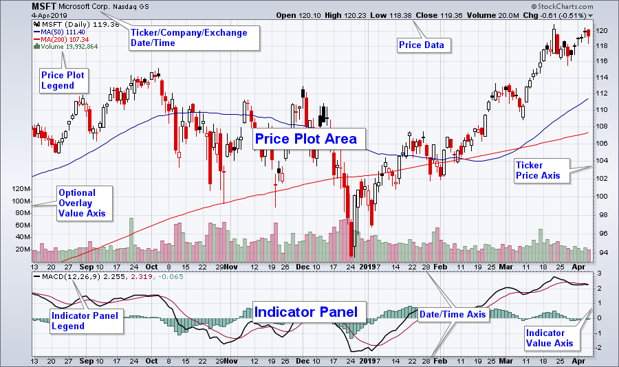
The example above illustrates the layout of a typical SharpChart. Price data, volume data and technical indicators are displayed on a SharpChart. A technical indicator is a mathematical expression of price and/or volume which can provide insight into future price movements. We will talk more about technical indicators later.
Price data and overlays are plotted in the Price Plot Area. Overlays are technical indicators that are normally expressed in terms of price. Non-price values of overlays are displayed on the left axis as shown above.
Technical indicators that cannot be expressed in terms of price are normally plotted in the Indicator Panels. Although only a single Indicator Panel is shown above, SharpCharts can be created with multiple Indicator Panels displayed above and below the Price Plot Area. Additional date/time axes can be added between the Indicator Panels if needed. The legend for both the Price Plot Area and Indicator Panel contain the information used to create the SharpChart.
Next time, we'll get into the specifics of line charts, OHLC Bar charts, and candlestick charts.