|
|
This is an old revision of the document!
Table of Contents
Ulcer Index
Developed by Peter Martin and Byron McCann in 1987, the Ulcer Index is a volatility indicator that measures downside risk. It was first introduced in their 1989 book, The Investor's Guide to Fidelity Funds. Originally, the index was designed with mutual funds in mind, which is why it is only focused on downside risk. Mutual funds are designed to make money by increasing in value; the only risk, therefore, is the drawdown or downside. As its name implies, the Ulcer Index measures the drawdown investors can expect to stomach on any given security. Many consider the Ulcer Index superior to the standard deviation and other measures of risk.
Calculation
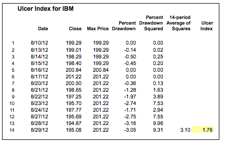
Based on closing prices, the Ulcer Index measures volatility based on price depreciation from its high over a specific look-back period. The index is zero if prices close higher each period. This means there is no downside risk because prices are steadily rising. Prices, of course, do not steadily rise, so there will be declines along the way. Using a default setting of 14 periods, the Ulcer Index reflects the expected percentage drawdown over this period. The table shows a sample calculation for 14-periods.
Percent-Drawdown = ((Close - 14-period Max Close)/14-period Max Close) x 100

Squared Average = (14-period Sum of Percent-Drawdown Squared)/14

Ulcer Index = Square Root of Squared Average
Interpretation
The following comes from Peter G. Martin himself:
“Ulcer Index measures the depth and duration of percentage drawdowns in price from earlier highs. The greater a drawdown in value, and the longer it takes to recover to earlier highs, the higher the UI. Technically, it is the square root of the mean of the squared percentage drawdowns in value. The squaring effect penalizes large drawdowns proportionately more than small drawdowns.”
It is hard to say it much better than that so we will leave it as is.
Comparing Funds
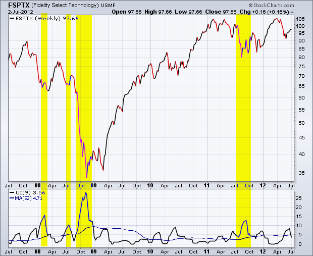
As a statistical measure, investors can compare Ulcer Index values to determine relative risk. Martin notes that the Ulcer Index works well with weekly data. The first chart below shows weekly closes for the Fidelity Select Technology Fund (FSPTX) with the 9-period Ulcer Index in the indicator window. A 52-period moving average was added to smooth the index and show a long-term average. There were three spikes above 10 in 2008 and another in 2011 (yellow highlights); perhaps 2008 was an anomaly because of the financial crisis. With only one spike above 10 since 2008, investors can conclude that a spike above 10 is relatively rare. The 52-period moving average was at 4.71 and this value could be used to measure adjusted return.
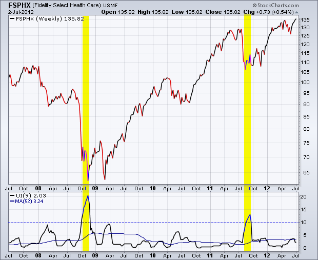
The second chart shows the Fidelity Select Health Care Fund (FSPHX) with the same chart features. The Ulcer Index breached 10 twice, once in 2008 and once in 2011. The 52-week moving average is at 3.24, which is much lower than the moving average for the technology fund. This means the health care fund has less risk or drawdown potential than the technology fund.
Risk-Adjusted Return
The Sharpe Ratio is used to measure risk-adjusted return. It is simply total return less the risk-free return divided by the standard deviation. As noted above, the standard deviation is considered inferior because it accounts for both upside and downside volatility. Long-only investors are not concerned with upside volatility; it is downside volatility that produces drawdowns and stomach ulcers. To account for this, Martin introduced the Ulcer Performance Index (UPI), or Martin Ratio. This is simply total return less the risk-free return divided by the Ulcer Index. The goal is to find securities (funds) with the highest UPI, which means the highest risk-adjusted return.

The table above compares the Fidelity Select Technology Fund (FSPTX) with the Fidelity Select Health Care Fund (FSPHX). The 10-year Treasury Yield ($TNX) represents the risk-free rate. The Ulcer Index is a 52-week average of the 9-week Ulcer Index. The expected return is based on the 10-year total return data from Morningstar. The expected return and the Ulcer Index are both higher for the technology fund. Based on the higher UPI, the health care fund appears to provide a better risk-adjusted return than the technology fund.
Conclusion
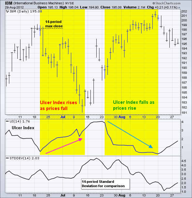
The Ulcer Index measures risk by focusing on drawdowns represented by price declines. This means it is best suited for long-only investors or traders. The index hovers near zero when prices regularly record higher highs and advance. The index rises when prices move lower and extend from their recent high. Keep in mind that the Ulcer Index is not an indicator per se. It is just a measure of downside risk that can be used to compute risk-adjusted returns.
Using with SharpCharts
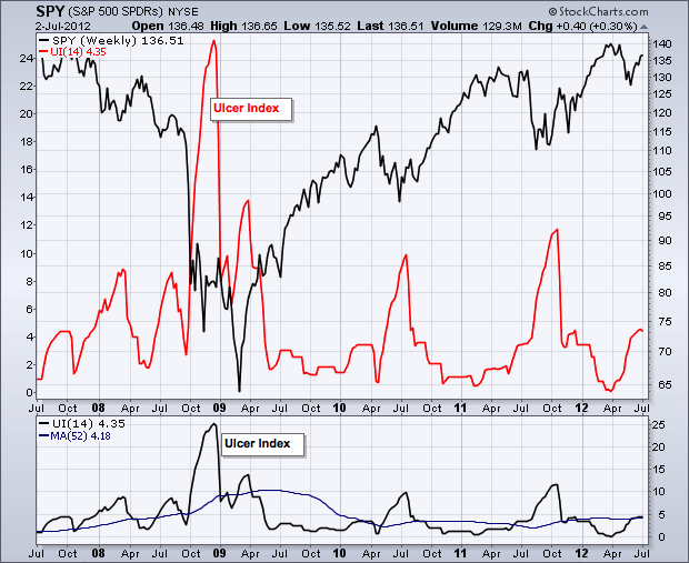
The Ulcer Index is available as an indicator for SharpCharts. Once selected, users can place the indicator above, below or behind the underlying price plot. Placing the Ulcer Index directly behind the price plot accentuates the movements relative to the price action of the underlying security. Users can apply “advanced options” to add horizontal lines to set a risk threshold. Click here for a live example of the Ulcer Index in action.

Suggested Scans
Weeding Out High Volatility
The Ulcer Index can be used in scans to weed out securities with extremely high volatility. This simple scan searches for S&P 600 stocks that are in an uptrend. The final scan clause excludes high volatility stocks from the results.
[group is SP600]
AND [Daily EMA(50,close) > Daily EMA(200,close)]

AND [ULCER(14) < 10]
For more details on the syntax to use for Ulcer Index scans, please see our Scanning Indicator Reference in the Support Center.

