|
|
Table of Contents
Slope Performance Trend
Introduction
Trend direction and relative strength are important components of any investment strategy designed to outperform the overall market. This article will show chartists how to use the slope indicator to define trend direction and quantify relative strength. Sectors that show relative strength and are in uptrends are worthy of long positions. Sectors that show relative weakness and are in downtrends should be avoided. This strategy goes to the heart of a basic investment philosophy: buy the strong and avoid the weak.
The Slope Indicator
The slope indicator is at the heart of this strategy, so we will first explain what it tells us and how it works. Even though it sounds complicated, the slope indicator is actually pretty easy is to understand. All you need to know is that the trend is up when the slope is positive and is down when the slope is negative. For those looking for a technical explanation, the slope indicator measures the rise over the run for a linear regression. Fortunately, we have algorithms and charting software to do all the calculation work for us. In SharpCharts, chartists can use the Raff Regression Channel to plot a linear regression, which is the middle line. The chart below shows three Raff Regression Channels covering three twelve-month periods. The slope of the first linear regression (blue) is relatively flat, the second slope (red) is clearly down and the third slope (green) is clearly up.
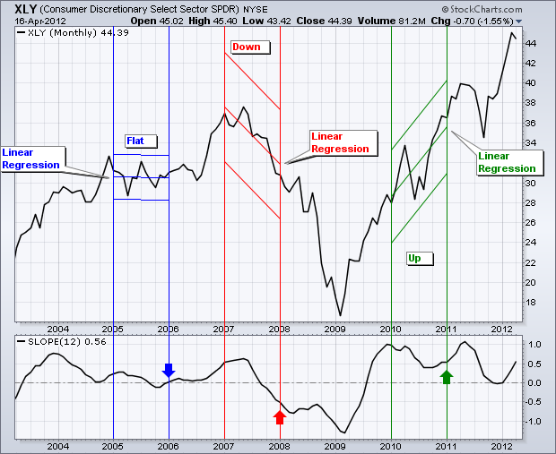
The indicator window shows the actual values of the slope indicator. Remember, the slope measures the rise over run for the linear regression. This is the ending value of the linear regression less the beginning value divided by the timeframe. If the ending value were 35, the beginning value 29 and the run 12, then the slope would be .5 (35 - 29 = 6, 6/12 = .50). The slope indicator is zero when the linear regression is flat, positive when the linear regression slants up and negative when the linear regression slopes down. The steepness of the slope is also reflected in the value. Slope values well above zero reflect a sharply rising linear regression (uptrend), while slope values well below zero reflect a sharply falling linear regression (downtrend).
Trend Direction
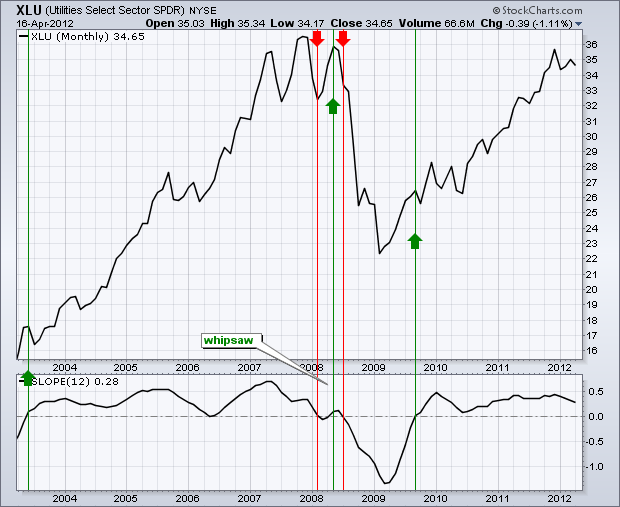
Trend direction can be defined with the 12-month slope of the closing prices. This means we will use monthly charts to define the trend based on the direction of the one-year slope. The chart below shows the Utilities SPDR (XLU) with a 12-month slope indicator changing direction five times in ten years. There was one whipsaw (bad signal) in early 2008, but the other signals foreshadowed decent trends. No indicator is perfect and whipsaws are unavoidable. However, most of the time, the 12-month slope will produce fewer whipsaws than the 12-month simple moving average.
Relative Performance
Chartists can use the price relative to measure relative strength and relative weakness. The price relative is a ratio of the underlying security divided by the benchmark index. In this example, we will use the nine S&P Sector SPDRs as the trading vehicles and the S&P 500 ETF (SPY) as the benchmark index. To measure the performance of the Technology SPDR (XLK) relative to the S&P 500 ETF, chartists would plot the ratio of the two symbols (XLK:SPY). This ratio rises when XLK outperforms and shows relative strength, and falls when XLK underperforms and shows relative weakness.
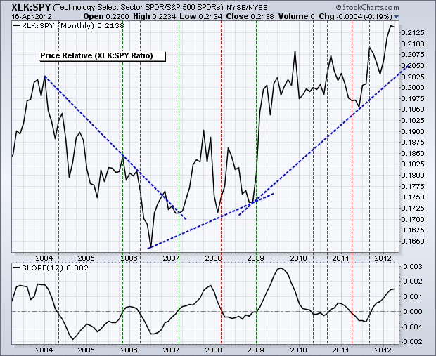
The chart above shows the price relative or XLK:SPY ratio in the main window and the 12-month slope in the indicator window. Overall, the price relative declined from 2004 to mid-2006 and advanced from mid-2006 until early 2012. The 12-month slope moved from positive to negative as these relative performance trends strengthened and weakened. A positive slope shows strong outperformance, while a negative slope shows strong underperformance.
Strategy Details
The strategy is quite straightforward. Buy signals are generated when the 12-month slope for the price chart is positive and when the 12-month slope for the price relative is positive. This two-pronged approach ensures that the sector is in an uptrend and shows relative strength, which makes for a powerful combination. A sell signal is generated when the 12-month slope for the price chart is negative and the 12-month slope for the price relative is negative. Again, this ensures that the sector is in a downtrend and shows relative weakness.
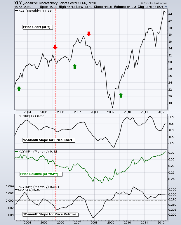
The chart above shows the Consumer Discretionary SPDR (XLY) with the 12-month slope for the price chart in the top indicator window, the price relative in the middle indicator window and the 12-month slope of the price relative in the bottom window. There were only five signals in ten years, which makes this a long-term model. The sell signal in 2005 caused a whipsaw and missed most of the surge in the third quarter of 2006. Despite this whipsaw, this strategy would have exited XLY before the 2008 bear market and caught most of the bull market that started in 2009.
Increasing Signal Frequency
While this strategy can be used to define the big trend, chartists should implement another strategy to time short- or medium-term movements. After all, some traders, or even investors, may need more than five signals every ten years. Using the slope indicators on the monthly chart, the Industrials SPDR (XLI) triggered a buy signal in November 2010. While the trend was clearly up, the risk-reward ratio did not look so great after such a sharp advance. Chartists could then turn to the daily chart and the Commodity Channel Index (CCI) to generate bullish signals within this uptrend.
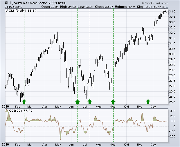
The chart above shows XLI with daily bars and the Commodity Channel Index (CCI) in 2010. With the long-term trend up, bullish signals are taken and bearish signals are ignored. A bullish signal triggers when CCI becomes oversold and then moves above the zero line, which occurred five times in 2010. The June signal resulted in a whipsaw (bad trade), but the other signals foreshadowed sizable advances. Even though bearish signals are ignored, chartists would need to employ a stop-loss or profit-taking strategy to lock in gains.
Strong and Weak Sectors
Applying the slope to the price relative can also help chartists differentiate strong sectors from weak sectors. In this regard, investors can focus on strong sectors for long positions and avoid or short weak sectors. The chart below shows the 12-month slope for six price relatives. The green boxes highlight positive slopes and relative strength, while the red boxes highlight negative slopes and relative weakness.
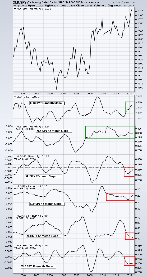
In early 2012, only the technology (XLK:SPY) and consumer discretionary (XLY:SPY) sectors were showing relative strength, as measured by the 12-month slope of their price relatives. Chartists could have used this information to focus their buying power on stocks within these two sectors. The other four sectors showed relative weakness because the slopes for their price relatives were in negative territory. Chartists could have used this information to avoid these sectors in 2012.
Conclusion
By applying the slope indicator to both the price chart and the price relative, chartists can quantify the price trend and relative performance with one indicator. A positive slope indicates an uptrend and a negative slope indicates a downtrend. It is as easy as that. Even though 12-month slopes were used in this example, chartists can adjust the timeframe to suit their needs. A 13-week slope could be used for medium-term timing, while a 20-day slope could be used for the short-term timing. Keep in mind that this article is designed as a starting point for trading system development. Use these ideas to augment your trading style, risk-reward preferences and personal judgments.

