
|
Table of Contents
What Are Charts?
Introduction
A price chart is a sequence of prices plotted over a specific timeframe. In statistical terms, charts are referred to as time series plots.
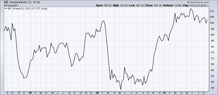
On the chart, the y-axis (vertical axis) represents the price scale and the x-axis (horizontal axis) represents the time scale. Prices are plotted from left to right across the x-axis, with the most recent plot being the furthest right. The price plot for GE extends from August 24, 2018 to August 24, 2021.
Technicians, technical analysts and chartists use charts to analyze a wide array of securities and forecast future price movements. The word “security” refers to any tradable financial instrument or quantifiable index such as stocks, bonds, commodities, futures or market indices. Any security with price data over a period of time can be used to form a chart for analysis.
While technical analysts use charts almost exclusively, the use of charts is not limited to just technical analysis. Because charts provide an easy-to-read graphical representation of a security's price movement over a specific period of time, they can also be of great benefit to fundamental analysts. A graphical historical record makes it easy to observe a security's performance over a period of time, whether it's trading near its highs, lows or inbetween, as well as the effect of key events on its price.
How to Pick a Timeframe
The timeframe used for forming a chart depends on the compression of the data: intraday, daily, weekly, monthly, quarterly or annual data. The less compressed the data is, the more detail is displayed.
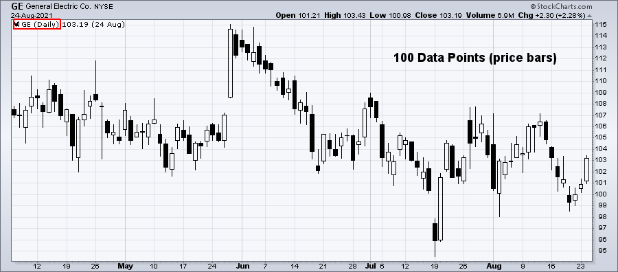
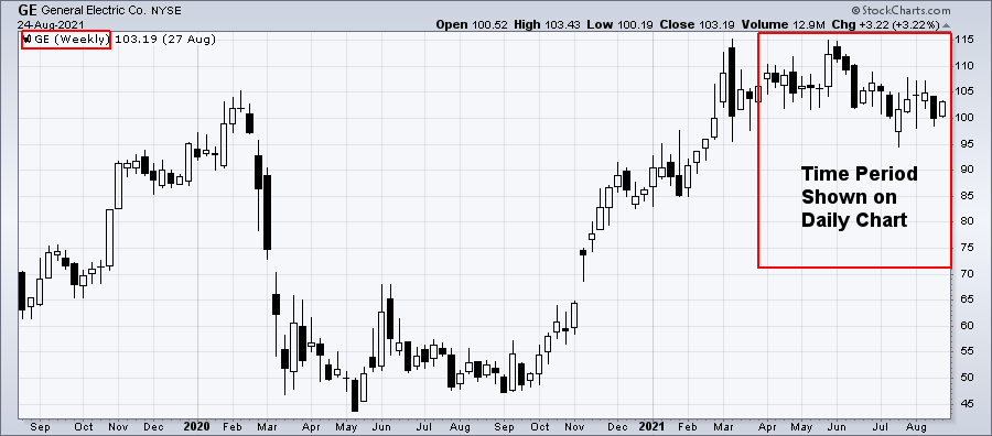
Daily data is made up of intraday data that has been compressed to show each day as a single data point, or period. Weekly data is made up of daily data that has been compressed to show each week as a single data point. The difference in detail can be seen with the daily and weekly chart comparison above. 100 data points (or periods) on the daily chart is equal to the last 5 months of the weekly chart, which is shown by the data marked in the rectangle. The more the data is compressed, the longer the timeframe possible for displaying the data. If the chart can display 100 data points, a weekly chart will hold 100 weeks (almost 2 years). A daily chart that displays 100 days would represent about 5 months. There are about 20 trading days in a month and about 252 trading days in a year. The choice of data compression and timeframe depends on the data available and your trading or investing style.
- Traders usually concentrate on charts made up of daily and intraday data to forecast short-term price movements. The shorter the timeframe and the less compressed the data is, the more detail that is available. While long on detail, short-term charts can be volatile and contain a lot of noise. Large sudden price movements, wide high-low ranges and price gaps can affect volatility, which can distort the overall picture.
- Investors usually focus on weekly and monthly charts to spot long-term trends and forecast long-term price movements. Because long-term charts (typically 1-4 years) cover a longer timeframe with compressed data, price movements do not appear as extreme and there is often less noise.
- Others might use a combination of long-term and short-term charts. Long-term charts are good for analyzing the large picture to get a broad perspective of the historical price action. Once the general picture is analyzed, a short-term chart, such as a daily chart can be used to zoom in on a narrower range of time (e.g. the last few months).
How Are Charts Formed?
We will be explaining the construction of line, bar, candlestick and point & figure charts. Although there are other methods available, these are 4 of the most popular methods for displaying price data.
Line Chart
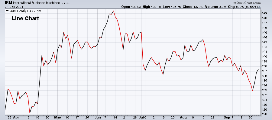
Some investors and traders consider the closing level to be more important than the open, high or low. By paying attention to only the close, intraday swings can be ignored. Line charts are also used when open, high and low data points are not available. Sometimes only closing data are available for certain indices, thinly-traded stocks, and intraday prices.
Bar Chart
Perhaps the most popular charting method is the bar chart. The high, low and close are required to form the price plot for each period of a bar chart. The high and low are represented by the top and bottom of the vertical bar and the close is the short horizontal line crossing the vertical bar. On a daily chart, each bar represents the high, low and close for a particular day. Weekly charts would have a bar for each week based on Friday's close and the high and low for that week.
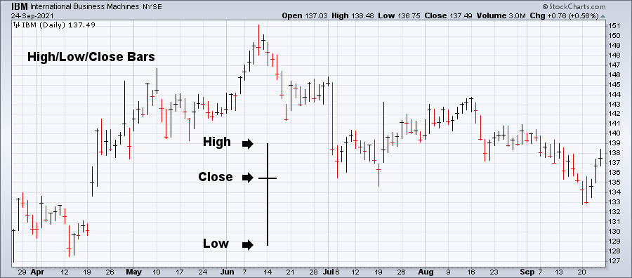
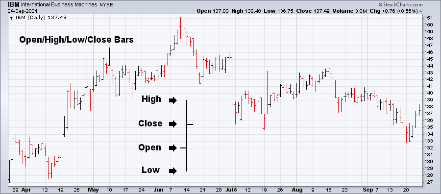
Bar charts can also be displayed using the open, high, low and close. The only difference is the addition of the open price, which is displayed as a short horizontal line extending to the left of the bar. Whether or not a bar chart includes the open depends on the data available.
Bar charts can be effective for displaying a large amount of data. Using candlesticks, 200 data points can take up a lot of room, resulting in a cluttered chart. Line charts show less clutter, but do not offer as much detail (no high-low range). The individual bars that make up the bar chart are relatively skinny, which allows users the ability to fit more bars while keeping the chart comparatively neat. If you are not interested in the opening price, bar charts are an ideal method for analyzing the close relative to the high and low. In addition, bar charts that include the open will tend to become cluttered more quickly. If you are interested in the opening price, candlestick charts probably offer a better alternative.
Candlestick Chart
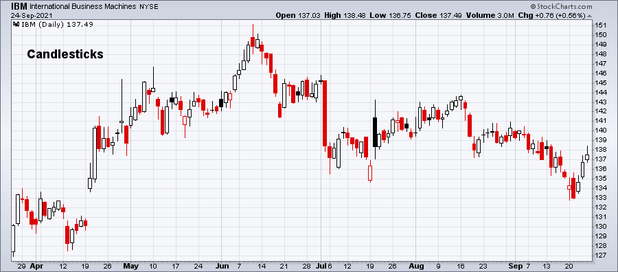
Originating in Japan over 300 years ago, candlestick charts have become quite popular in recent years. For a candlestick chart, the open, high, low and close are all required. A daily candlestick is based on the open price, the intraday high and low, and the close. A weekly candlestick is based on Monday's open, the weekly high-low range and Friday's close.
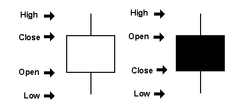
Many traders and investors believe that candlestick charts are easy to read, especially the relationship between the open and the close. Hollow candlesticks form when the close is higher than the open and filled candlesticks form when the close is lower than the open. The rectangular portion formed from the open and close is called the body (hollow body or filled body). The lines above and below are called shadows and represent the high and low.
Some candlestick charts use color to show the relationship between the close and the previous close. If the close is higher than the previous close, the candle is colored black; if the close is lower, then the candle is colored red. See this ChartSchool article for more information about candlestick charts.
Point & Figure Chart
All the charting methods shown above plot one data point for each period of time. No matter how much price movement occurred, each day or week represented is one point, bar, or candlestick along the time scale. Even if the price is unchanged from day to day or week to week, a dot, bar, or candlestick is plotted to mark the price action. Contrary to this methodology, point & figure charts are based solely on price movement, and do not take time into consideration. There is an x-axis, but it does not extend evenly across the chart.
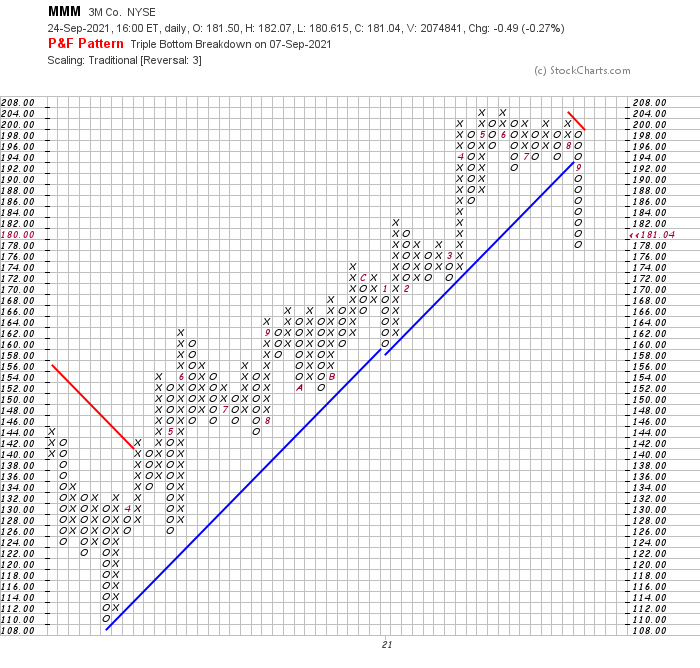
The beauty of point & figure charts is in their simplicity. Little or no price movement is deemed irrelevant and therefore not duplicated on the chart. Only price movements that exceed specified levels are recorded. This focus on price movement makes it easier to identify support and resistance levels, bullish breakouts and bearish breakdowns. This P&F article has a more detailed explanation of point & figure charts.
Price Scaling
There are two methods for displaying the price scale along the y-axis: arithmetic and logarithmic. An arithmetic scale displays 10 points (or dollars) as the same vertical distance no matter what the price level. Each unit of measure is identical throughout the entire scale. If a stock advances from 10 to 80 over a 6-month period, the move from 10 to 20 will appear to be the same distance as the move from 70 to 80. Even though this move is the same in absolute terms, it is not the same in percentage terms.
A logarithmic scale, or log scale, measures price movements in percentage terms. An advance from 10 to 20 would represent an increase of 100%. An advance from 20 to 40 would also be 100%, as would an advance from 40 to 80. All three of these advances would appear as the same vertical distance on a log scale. Most charting programs refer to the log scale as a semi-log scale, because the time axis is still displayed arithmetically.
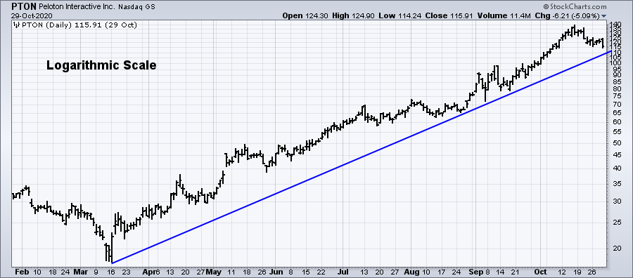
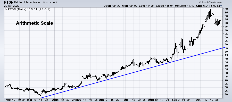
The chart above uses the performance of Peloton to illustrate the difference in scaling. On the log scale version, the distance between 20 and 40 is the same as the distance between 40 and 80. However, on the arithmetic scale, the distance between 40 and 80 is significantly greater than the distance between 20 and 40.
Key points on the benefits of arithmetic scale charts include:
- Arithmetic scales are useful when the price range is confined within a relatively tight range.
- Arithmetic scales are useful for short-term charts and trading. Price movements (particularly for stocks) are shown in absolute dollar terms and reflect movements dollar for dollar.
Key points on the benefits of log scale charts include:
- Log scales are useful when the price has moved significantly, be it over a short or extended timeframe
- Trend lines tend to match lows better on log scale charts.
- Log scale charts are useful when gauging the percentage movements over a long period of time. Large movements are put into better perspective.
Stocks and many other securities are judged in relative terms through the use of ratios such as PE, Price/Revenues and Price/Book. With this in mind, it also makes sense to analyze price movements in percentage terms.
Conclusion
Even though many different charting techniques are available, one method is not necessarily better than the other. The data may be the same, but each method will provide its own unique interpretation with benefits and drawbacks. A breakout on the point & figure chart may not occur in unison with a breakout in a candlestick chart. Signals that are available on candlestick charts may not appear on bar charts. How the security's price is displayed, be it a bar chart or candlestick chart, with an arithmetic scale or semi-log scale, is not the most important aspect. After all, the data is the same and price action is price action. When all is said and done, it is the analysis of the price action that separates successful technicians from not-so-successful technicians. The choice of which charting method to use will depend on personal preferences and trading or investing styles. Once you have chosen a particular charting methodology, it is probably best to stick with it and learn how best to read the signals. Switching back and forth may cause confusion and undermine the focus of your analysis. Faulty analysis is rarely caused by the chart. Before blaming your charting method for missing a signal, first look at your analysis.
The keys to successful chart analysis are dedication, focus, and consistency:
- Dedication: Learn the basics of chart analysis, apply your knowledge on a regular basis, and continue your development.
- Focus: Limit the number of charts, indicators and methods you use. Learn how to use them and how to use them well.
- Consistency: Maintain your charts on a regular basis and study them often (daily if possible).