|
|
This is an old revision of the document!
Table of Contents
Percentage Price Oscillator
Introduction
The Percentage Price Oscillator (PPO) is a momentum oscillator that measures the difference between two moving averages as a percentage of the larger moving average. As with its cousin, MACD, the Percentage Price Oscillator is shown with a signal line, a histogram and a centerline. Signals are generated with signal line crossovers, centerline crossovers, and divergences. Because these signals are no different than those associated with MACD, this article will focus on a few differences between the two. First, PPO readings are not subject to the price level of the security. Second, PPO readings for different securities can be compared, even when there are large differences in the price. See the ChartSchool article on MACD for information on signals common to both MACD and PPO.
Calculation
Percentage Price Oscillator (PPO): {(12-day EMA - 26-day EMA)/26-day EMA} x 100

Signal Line: 9-day EMA of PPO

PPO Histogram: PPO - Signal Line
While MACD measures the absolute difference between two moving averages, PPO makes this a relative value by dividing the difference by the slower moving average (26-day EMA). PPO is simply the MACD value divided by the longer moving average. The result is multiplied by 100 to move the decimal place two spots. The table below shows Intel (INTC) with values for the 12-day EMA, 26-day EMA, MACD and PPO. Intel is priced in the low 20s and MACD values range from -44 cents to +64 cents. PPO puts this in percentage terms with values ranging from -2.01 to +2.85. It is easier to compare levels over time with percentages. -2.01 is equivalent to -2.01%, while +2.85 is equivalent to +2.85%.
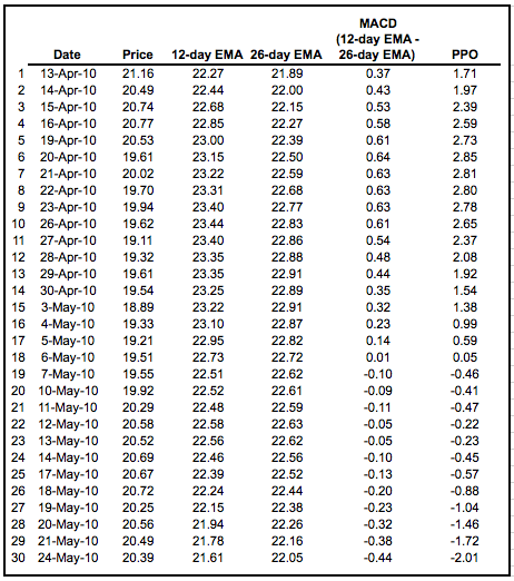
Click here to download this spreadsheet example.
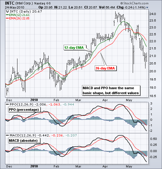
Standard PPO is based on the 12-day Exponential Moving Average (EMA) and the 26-day EMA, but these parameters can be changed according to investor or trader preferences. Closing prices are used to calculate the moving averages and, therefore, PPO signals should be measured against closing prices. A 9-day EMA of PPO is plotted as a signal line to identify upturns and downturns in the indicator.
Interpretation
As with MACD, the PPO reflects the convergence and divergence of two moving averages. PPO is positive when the shorter moving average is above the longer moving average. The indicator moves further into positive territory as the shorter moving average distances itself from the longer moving average. This reflects strong upside momentum. The PPO is negative when the shorter moving average is below the longer moving average. Negative readings grow when the shorter moving average distances itself from the longer moving average (goes further negative). This reflects strong downside momentum. The histogram represents the difference between PPO and its 9-day EMA, the signal line. The histogram is positive when PPO is above its 9-day EMA and negative when PPO is below its 9-day EMA. The PPO-Histogram can be used to anticipate signal line crossovers in the PPO. See the ChartSchool article on the MACD Histogram for signal details.
MACD, PPO and Price
MACD levels are affected by the price of a security. A high-priced security will have higher or lower MACD values than a low-priced security, even if volatility is basically equal. This is because MACD is based on the absolute difference in the two moving averages. Chart 2 shows Google with MACD and PPO for comparative purposes. The 12-day EMA is around 495, the 26-day EMA is around 512 and the difference is -17 (double digits). Notice that Google's MACD reached double digits on the upside and the downside, but the Percentage Price Oscillator ranged from +2.5 to -3.5. MACD values appear higher because Google is priced at a relatively high level. MACD for the Dow Industrials, which is above 10,000, hits triple digits on a regular basis. However, the PPO ranges from -2 to +2, which is a much more definable range.
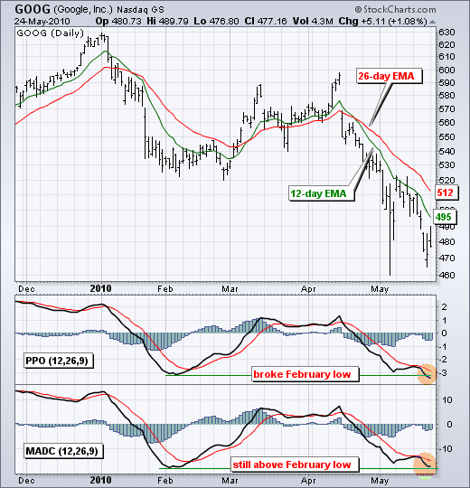
Although the indicator lines look the same, there are often subtle differences between MACD and PPO. In the Google example, notice how the PPO broke below the February low, but MACD has yet to break its February low. The lower low in the PPO shows expanding downside momentum.
Large Price Changes
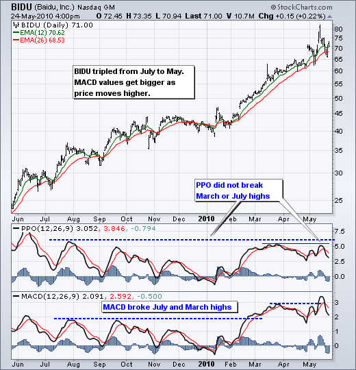
Because MACD is based on absolute levels, large price changes can affect MACD levels over an extended period of time. If a stock advances from 20 to 100, its MACD levels will be considerably smaller, closer to 20 than 100. The PPO solves this problem by showing MACD values in percentage terms. Chart 3 shows Baidu (BIDU) advancing from 25 to 75 over a 12-month period. MACD values around 25-30 are going to be generally smaller than MACD values around 70-80. Notice that MACD broke above its July and March highs, but the PPO did not break these corresponding highs. Also note that Baidu becomes overbought when the PPO exceeds +5.
Comparing Different Securities
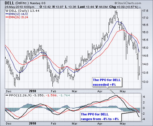
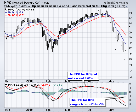
Because the Percentage Price Oscillator (PPO) is a percentage version of MACD, its values can be compared against other securities. Dell (DELL) and Hewlett Packard (HPQ) are in the same industry group, but their stock prices are at different levels. As of late May 2010, DELL was trading in the high teens and HPQ was trading in the mid-40s. The absolute price level has nothing to do with fundamentals, but it does affect the level of MACD. HPQ will no doubt have a higher MACD than DELL. However, we can apply the Percentage Price Oscillator (PPO) to compare momentum. First, notice that the PPO for DELL ranges from -4 to +4 for an 8 point range). The PPO for HPQ ranges from -3 to +2 for a range of 5. Right off the bat, we can see that DELL is more volatile than HPQ because its PPO range is greater. Second, we can see that upside momentum for DELL was stronger than HPQ in March-April. The PPO for DELL advanced from negative territory and exceeded 4. The PPO for HPQ turned positive before the PPO for DELL, but did not exceed 1.6.
Conclusion
The Percentage Price Oscillator (PPO) generates the same signals as the MACD, but provides an added dimension as a percentage version of MACD. The PPO levels of the Dow Industrials (price ~11000) can be compared against the PPO levels of IBM (price ~122) because the PPO “levels” the playing field, so to speak. In addition, PPO levels in one security can be compared over extended periods of time, even if the price has doubled or tripled. This is not the case for the MACD. Despite its advantages, the PPO is still not the best oscillator to identify overbought or oversold conditions because movements are unlimited (in theory). Levels for RSI and the Stochastic Oscillator are limited, making them better suited to identifying overbought and oversold levels.
Using with SharpCharts
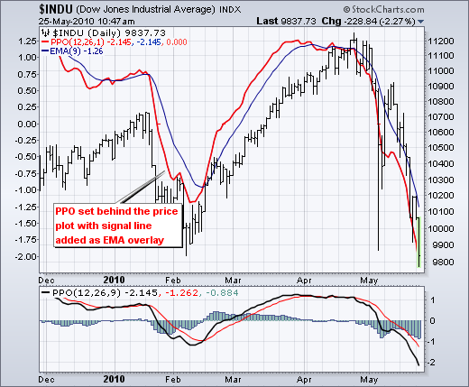
The PPO can be set as an indicator above, below or behind a security's price plot. Once the indicator is chosen from the dropdown list, the default parameter setting appears (12,26,9). These parameters can be adjusted to increase or decrease sensitivity. A slower long moving average combined with a faster short moving average will increase sensitivity. The histogram can be removed by setting the signal line parameter to 1. This is helpful when displaying the PPO behind the price plot of a security. Users can even add back the signal line by applying a 9-day EMA to the PPO. Click “advanced options” to add the moving average as an overlay for an indicator. Click here for a live example of the PPO.

Suggested Scans
PPO Bullish Signal Line Cross
This scan reveals stocks that are trading above their 200-day moving average and have a bullish signal line crossover in the PPO. Notice that the PPO is required to be negative to ensure that this upturn occurs after a pullback. This scan is just meant as a starting point for further refinement.
[type = stock] AND [country = US]
AND [Daily SMA(20,Daily Volume) > 40000]
AND [Daily SMA(60,Daily Close) > 20]

AND [Daily Close > Daily SMA(200,Daily Close)]
AND [Yesterday's Daily PPO Line(12,26,9,Daily Close) < Daily PPO Signal(12,26,9,Daily Close)]
AND [Daily PPO Line(12,26,9,Daily Close) > Daily PPO Signal(12,26,9,Daily Close)]
AND [Daily PPO Line(12,26,9,Daily Close) < 0]
PPO Bearish Signal Line Cross
This scan reveals stocks that are trading below their 200-day moving average and have a bearish signal line crossover in PPO. Notice that the PPO is required to be positive to ensure that this downturn occurs after a bounce. This scan is just meant as a starting point for further refinement.
[type = stock] AND [country = US]
AND [Daily SMA(20,Daily Volume) > 40000]
AND [Daily SMA(60,Daily Close) > 20]

AND [Daily Close < Daily SMA(200,Daily Close)]
AND [Yesterday's Daily PPO Line(12,26,9,Daily Close) > Daily PPO Signal(12,26,9,Daily Close)]
AND [Daily PPO Line(12,26,9,Daily Close) < Daily PPO Signal(12,26,9,Daily Close)]
AND [Daily PPO Line(12,26,9,Daily Close) > 0]
For more details on the syntax to use for PPO scans, please see our Scan Syntax Reference in the Support Center.
