Table of Contents
TA 101 - Part 4
This is the fourth part of a series of articles about technical analysis from a new course we're developing. If you are new to charting, these articles will give you the “big picture” behind the charts on our site. If you are an “old hand”, these articles will help ensure you haven't “strayed too far” from the basics. Enjoy!
(Click here to see the entire series.)
Line Charts
Line charts are created by plotting a line between the closing prices for each period set on the chart. On a daily chart, a line is plotted between the daily closing prices. Line charts are useful to help visualize the direction of prices. The extent of rallies and reactions in trends can also be quickly deduced.
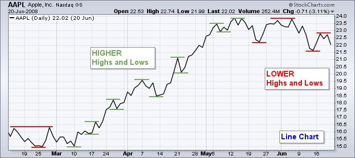
A five-month price SharpChart of Apple, Inc. (AAPL) is plotted above in a line format. Higher highs and lows are annotated with green dashes and lower highs and lows with red dashes. Between March and mid-May 2008, the direction of prices is readily apparent with higher highs and lows. After mid-May 2008, prices began to make lower highs and lows.
A line chart is plotted by default when only end-of-day (closing) prices are available for a symbol. Examples of such symbols include all mutual funds and some market indices. However, weekly and monthly price bars can be charted for ticker symbols with only end-of-day (EOD) quotes.
OHLC Charts
Open-High-Low-Close (OHLC) bar charts provide volatility information that line charts lack. The attributes of an OHLC bar are shown below. The chartist can evaluate volatility by the height of the bars and the conviction of the buyers and sellers by the price range between the open and close marks.
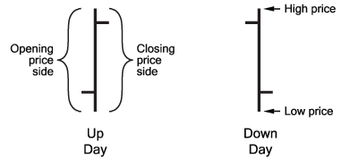
For the left price bar, the CLOSE mark is above the OPEN mark indicating price ended higher for the day, known as an up day. This price bar is considered bullish. Bullish sentiment is present when greed for gain exceeds fear of loss and prices move higher.
With the price bar on the right, the OPEN is higher than the CLOSE indicating price ended lower for the day, known as a down day. This is a bearish price bar. Bearish sentiment is present when fear of loss is greater than greed for gain and prices move lower.
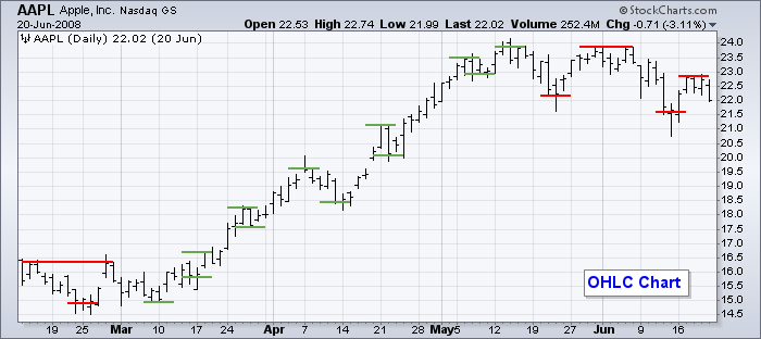
The SharpChart of AAPL above illustrates the OHLC format.
Notice how intraday price swings pass through the red and green reference marks made at the closing price levels on the previous Line chart. This illustrates why line charts are useful for visualizing price direction.
OHLC Bar Colors
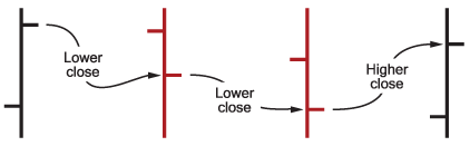
When the 'Color Prices' option is selected on the Chart Attributes workbench, the price bars will be colored black or red, depending on how a price bar's closing price relates to the previous day's closing price. If the closing price is higher than the previous day's closing price, the price bar will be black. If the closing price is lower than the previous day's, the price bar will be red. With this convention, it is possible to have a black price bar with the close being lower than the open.
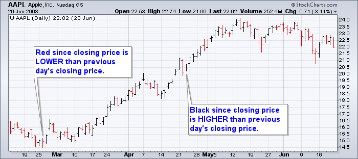
Colored OHLC price bars are shown in the AAPL SharpChart above. As discussed earlier, the color of the price bar is only based on the previous day's closing price, not the current day's opening price. Up day and down day price bars are usually black and red respectively, but that is not always the case as shown in the chart above.
Next time, we'll get into the specifics of candlestick charts.